Introduction
Your landing page design is doing one of two things: converting visitors into leads and customers, or leaking them silently back to Google. If you are running paid ads, email campaigns, or any form of targeted traffic, the page you send people to matters more than almost anything else in your marketing. A well-designed landing page can double or triple your results. A poorly designed one means you are paying for clicks that never become customers.
This guide covers what makes a high-converting landing page, which elements Irish businesses consistently get wrong, and how to structure a page that actually moves the needle for your business. Whether you are building your first campaign page or reviewing one that is not performing, you will find practical, specific guidance you can act on.
Why Landing Pages Are Not the Same as Regular Web Pages
Many Irish business owners send their ad traffic to the homepage. It makes sense on the surface: your homepage is polished, your brand is represented, and it explains what you do. The problem is that a homepage is designed to serve many different types of visitors at once. It has a navigation menu, multiple service sections, blog links, about pages, and a contact form buried in a footer. This gives visitors too many choices, and when people have too many choices, they often make none at all.
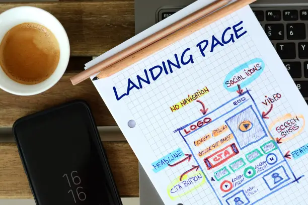
A landing page, by contrast, is built with a single goal. There is typically one headline, one offer, and one action you want the visitor to take. Navigation menus are usually removed entirely. The design, copy, and layout all point in one direction: conversion.
For Irish businesses investing in Google Ads, Meta Ads, or LinkedIn campaigns, directing traffic to a dedicated landing page rather than a general website page can significantly improve the return on that spend. The average website converts between one and three per cent of visitors. A well-optimised landing page in the right industry can reach five to fifteen per cent, depending on the offer and the quality of the traffic.
If you are currently driving any form of paid traffic, this gap between homepage performance and landing page performance represents real money. Even a modest improvement in conversion rate from two per cent to four per cent means twice as many leads from the same ad budget.
Key Elements of Effective Landing Page Design
Understanding the principles of landing page design is one thing; applying them in a way that connects with an Irish audience is another. Here are the core components that separate pages that convert from pages that do not.
A Headline That Speaks to the Right Problem
Your headline is the first thing a visitor reads and, in most cases, it determines whether they stay or leave within the first five seconds. A strong headline directly addresses the problem your customer is trying to solve or the specific outcome they want to achieve. It must be clear, specific, and immediately relevant.
Weak headlines: "Welcome to Our Business" or "Professional Services You Can Trust."
Strong headlines: "Local Plumbing Experts Ready to Fix Your Problem Today" or "Burst Pipe or Blocked Drain? Call Your Local Plumbing Experts Today"
The headline should communicate your value proposition before a visitor has to scroll. If they need to read several paragraphs to understand what you are offering, you have already lost a significant portion of your audience.
A Single, Clear Call to Action
Every element on your landing page should point toward one action: filling in a form, booking a call, making a purchase, or downloading a resource. When you give visitors multiple options, you dilute the conversion path and introduce doubt about what they should do next.
Your call to action (CTA) button should use specific, active language that tells the visitor exactly what will happen. "Get My Free Quote" performs better than "Submit." "Book a Free 20-Minute Consultation" performs better than "Contact Us." Make the CTA visible above the fold and repeat it further down the page for visitors who scroll to the bottom before deciding.
Trust Signals That Reduce Hesitation
Irish consumers, like most online buyers, need reassurance before they take action with a business they have not used before. Trust signals reduce the perceived risk of making an enquiry. Effective trust signals include:
- Client testimonials with a name, company, and ideally a photo
- Case studies or quantified results (number of leads generated, increase in sales)
- Logos of recognisable clients or partners
- Relevant certifications, trade body memberships, or awards
- A visible local phone number or address, which is particularly important for Irish audiences who value local credibility
If you are targeting Irish businesses specifically, mentioning your location or referencing Irish clients makes your page feel significantly more relevant than a generic international equivalent. A Galway business will respond differently to a page that mentions Connacht clients than to a page with stock photos and American testimonials.
Mobile-First Responsive Design
More than half of web traffic in Ireland arrives on mobile devices. If your landing page is not designed to work correctly on a small screen, you are losing a large proportion of potential leads before they have even read your offer.
Mobile-first design means building the page for small screens as the starting point, then scaling up for desktop. In practice this means larger, easily tappable buttons, short punchy paragraphs, vertically stacked content sections, and enquiry forms with as few fields as possible. A mobile visitor who has to pinch, zoom, or scroll sideways is gone within seconds, and they rarely come back.
Click here to read: The Importance of Mobile-First Design
Landing Page Components: High-Converting Approach vs. Common Mistakes
The table below compares the approach taken by high-converting landing pages against the mistakes that are most common in Irish business websites and campaign pages.
| Page Element | High-Converting Approach | Common Mistake |
|---|---|---|
| Headline | Specific, outcome-focused, addresses a clear pain point | Generic welcome message or company name as the headline |
| CTA Button | Action-specific language ("Get My Free Quote"), visible above the fold | Vague label ("Submit") buried below the fold or in the footer |
| Navigation Menu | Removed or stripped back to keep visitors focused on the one goal | Full site navigation included, pulling visitors to other pages |
| Form Length | 3 to 5 fields maximum for an initial lead generation enquiry | 10 or more fields asking for detailed information before any trust is built |
| Trust Signals | Real testimonials from named local clients, relevant credentials | No social proof, or generic stock photography with no context |
| Page Speed | Loads in under 3 seconds on mobile with compressed images | Heavy images and unoptimised scripts causing 6 to 10 second load times |
| Copy Direction | Benefit-led, written from the visitor's perspective and focused on their goal | Feature-led, talks about the business rather than the customer outcome |
How to Structure a High-Converting Landing Page: A Step-by-Step Breakdown
There is a well-tested layout that most high-converting landing pages follow. While no structure works identically for every business or offer, this framework is a strong starting point for Irish service businesses running targeted campaigns.
- Hero Section: Headline, subheadline, CTA button, and a supporting visual or short video. This is everything that must be visible without scrolling. It must be immediately clear who the page is for and what they can do next.
- Problem or Context Section: A short section that names the specific problem your customer is dealing with. This creates relevance and confirms to the visitor that they are in the right place.
- Solution Section: Explain clearly how your product or service solves that problem. Focus on outcomes rather than features. "You will get more qualified enquiries within 30 days" lands better than "We use advanced targeting and optimised campaigns."
- Social Proof: Testimonials, client logos, review ratings, or brief case study results. Position these after the solution section while the visitor is in a receptive mindset about what you offer.
- Offer or Detail Section: If your page has a specific offer (free consultation, site audit, free quote), state clearly what the visitor will receive, when they will hear back, and what happens after they submit. Removing uncertainty at this stage reduces form abandonment.
- Final CTA: Repeat your call to action at the bottom of the page for visitors who have read through everything and are now ready to act.
If you are planning a new campaign page or a full website rebuild, our web design and development services include dedicated landing page design built around your specific conversion goals and target audience.
Example: A Dublin Accountancy Firm Doubles Its Enquiry Rate
Fictional Case Example: Clearview Accountants, a three-person practice in Dublin, were running Google Ads targeting the phrase "accountant for small business Dublin." Their ads were getting clicks, but their homepage was converting less than one per cent of visitors. A dedicated landing page was built for the campaign: the navigation was removed, the headline was changed to "Reliable Accountancy for Dublin Small Businesses," a three-field enquiry form was included, and five real client testimonials were placed mid-page. Within three weeks of switching the ad traffic to the new page, their enquiry rate increased from 0.9 per cent to 2.7 per cent. The same ad budget was now producing three times as many leads.
Common Landing Page Design Mistakes Irish Businesses Make
Knowing what goes wrong on landing pages is often as useful as knowing what goes right. These are the most common errors that cost Irish businesses leads and waste ad budget every month.
Sending Paid Traffic to the Homepage
This is the single most widespread mistake. Your homepage serves all kinds of visitors and has multiple objectives at once. A visitor arriving from a specific ad campaign needs a focused page that matches the promise of the ad they clicked. Sending them to a homepage that was never designed to convert them means they arrive, feel uncertain about where to go, and leave. You have paid for the click, but the page has done none of the work.
Writing Copy That Talks About You Rather Than Your Customer
Landing pages that open with "We are an award-winning agency with 15 years of experience" put the business at the centre instead of the customer. Visitors do not primarily come to your page to learn about you. They arrive with a problem they want solved. Reframe every section around the visitor's outcome: "You will have a professionally designed, lead-generating website ready within three weeks."
Using a Form With Too Many Fields
Every additional field you add to an enquiry form reduces the number of people who complete it. Asking for name, phone, email, company, budget, project description, and how they found you all at once creates friction before any trust has been established. For an initial enquiry, name and email is often sufficient. You can gather the remaining details once a conversation has started and the lead has committed to speaking with you.
Ignoring Page Load Speed
A landing page that takes more than three seconds to load on a mobile device will lose a significant share of visitors before they have read a single word. Large uncompressed images, excessive third-party tracking scripts, and low-quality hosting are the most frequent causes. Page speed also directly affects your Google Ads Quality Score, meaning a slow page can increase your cost per click in addition to reducing your conversion rate.
Launching Once and Never Testing
Even experienced designers and copywriters cannot reliably predict which version of a landing page will perform best. The only reliable way to improve over time is to test. Running two versions of a page simultaneously and measuring which converts at a higher rate, known as A/B testing, is the most effective method available. Many Irish businesses launch a landing page and leave it untouched for months or years, missing conversions that small, data-backed improvements would have captured.
Practical Next Steps for Your Landing Page Strategy
If you are currently running any form of paid or organic traffic to a standard website page, the most valuable change you can make right now is creating a dedicated landing page for that traffic. Start with the campaign where you are spending the most, build a focused page using the structure above, and measure the results against your current conversion figures.
When reviewing whether your existing pages are working, look at your bounce rate and average session duration in Google Analytics. A landing page with a bounce rate above 70 per cent combined with an average session duration under 30 seconds is telling you directly that something is not connecting with the audience arriving on that page.
For more guidance on building a website that generates consistent leads, our blog covers SEO, web design, and digital strategy for Irish businesses at every stage of growth.
If you would like a dedicated, professionally designed landing page built around your specific campaign and conversion goals, get in touch with us for a no-obligation conversation. We work with businesses across Ireland and can help you turn the traffic you are already generating into real enquiries and customers.