Introduction
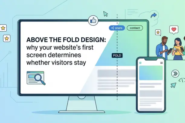
Your website has roughly five seconds to answer one question in a visitor's head: "Is this for me?" That question gets answered entirely by what they see before they scroll. Above the fold design, the portion of your page visible without any scrolling, is the single most consequential piece of real estate on your website. Get it right and visitors explore. Get it wrong and they leave, usually for good.
This guide covers what above the fold actually means in 2026, what elements belong there, how mobile changes the picture, and the mistakes that cost Irish businesses enquiries every single day. Whether you are planning a new site or reviewing an existing one, this is where you start. To find out more about our web design services check out Website Design Dublin
What "Above the Fold" Actually Means in Web Design
The term comes from print journalism. Newspapers folded in half on a newsstand, so the top half of the front page, the part visible without unfolding it, had to carry the strongest headline and most compelling image. The same logic applies to websites.
In web design, "above the fold" refers to everything a user sees on their screen when a page first loads, before they scroll. It is not a fixed pixel height. A 27-inch desktop monitor shows far more than a mobile phone held in portrait mode. The fold shifts depending on the device, browser zoom level, and screen resolution. That variability is part of why above the fold design is more nuanced than it sounds.
What has not changed is the underlying principle: content that requires no action to see gets seen. Content that requires scrolling gets significantly less attention. Research from the Nielsen Norman Group found that content positioned just above the fold receives, on average, 84% more engagement than content positioned just below it. That gap should inform every decision you make when laying out a homepage or landing page.
Why the First Screen Has Such a Disproportionate Impact on Bounce Rate
When a visitor lands on your site, they are not reading. They are scanning. Eye-tracking studies consistently show that users form a first impression within milliseconds and decide within a few seconds whether to stay or go. That decision is made almost entirely based on what is visible on arrival.
If your above the fold area is unclear, slow to load, or fails to communicate what you do and who you do it for, the visitor bounces. They press the back button, return to Google, and click the next result. You never know they were there, and you certainly do not get a second chance to make that impression.
For Irish business websites, this is a practical problem with real financial consequences. A tradesperson in Westmeath who gets 200 visitors a month but has a confusing or outdated homepage is losing a significant portion of those visitors before they ever see the services page, pricing information, or contact details. The traffic exists. The opportunity is being missed at the first screen.
There is also a Google dimension to this. Bounce rate and engagement metrics are signals that feed back into search rankings. A page that consistently drives visitors away quickly sends a negative quality signal. Improving above the fold design can improve both conversion rates and organic visibility at the same time.
The Six Elements That Belong Above the Fold
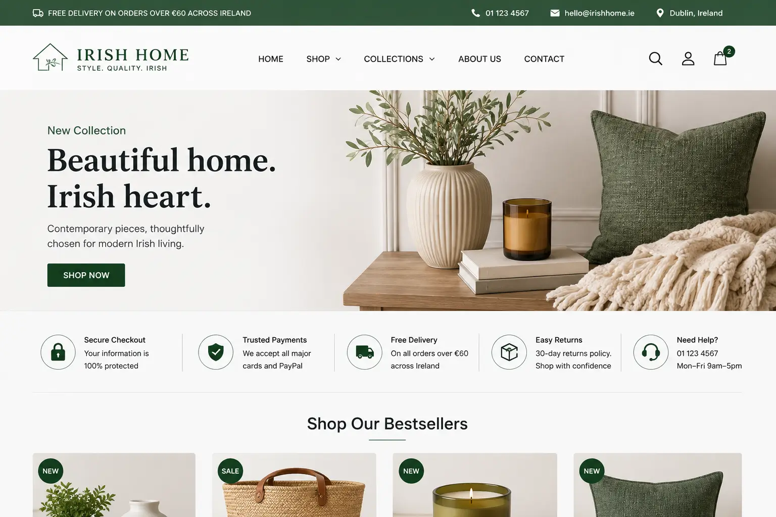
Not every page needs the same structure. A product page differs from a homepage, and a landing page differs from both. But for most Irish business websites, the homepage above the fold area should contain six things working together.
A clear headline that states what you do and who you serve. Not a welcome message. Not your company tagline. A direct statement like "Web Design for Irish Small Businesses" or "Electrical Contractors in Dublin and the Midlands" communicates immediately. The visitor should not have to read more than one sentence to understand what the site is about.
A supporting subheadline or description. One to two sentences that expand on the headline and speak directly to the visitor's situation. "We build fast, professional websites for trades businesses that need to generate leads, not just look good" is more useful than "Quality web design services for all business types."
A primary call to action. One button, one purpose. "Get a Free Quote", "Book a Consultation", or "See Our Work" are all valid. The mistake is having three or four CTAs competing for attention. Give the visitor one clear next step and make it visually prominent.
A relevant hero image or visual. This does not need to be a stock photo of people shaking hands. It should visually reinforce what the business does. A tradesperson's website benefits from a clean image of completed work. A professional services firm might use a confident headshot. The visual should complement the headline, not distract from it.
Navigation that is clean and functional. Your navigation bar sits at the very top of the fold. It should contain no more than five or six clear items. Users do not need twenty links in a cluttered menu. They need to be able to find Services, About, and Contact without effort.
A trust signal or social proof indicator. A Google review score, a short testimonial, a recognised accreditation badge, or even a simple "Serving Irish businesses since 2018" line builds enough initial credibility to encourage continued engagement. This is often omitted on SME websites and it makes a noticeable difference.
Above the Fold Design on Mobile: A Different Challenge Entirely
Here is the part many web designers and business owners overlook. What displays above the fold on a desktop bears very little resemblance to what a mobile user sees first. On a standard smartphone screen, the visible area is significantly smaller. A homepage that looks perfectly structured on a laptop can be a disaster on mobile, where the headline gets pushed down by a large navigation bar or an oversized hero image.
Since more than half of website traffic in Ireland now comes from mobile devices, your above the fold experience on mobile is arguably more important than on desktop. The practical implications are significant.
Read - The Importance of Mobile-First Design
Navigation bars on mobile should collapse into a clean hamburger menu immediately, taking up minimal vertical space. Hero images that work on desktop may need to be replaced or repositioned on mobile so they do not push the headline and CTA below the visible area. Text sizes need to be large enough to read without zooming. And the primary call to action button must be tappable without precise fingertip accuracy. Find out more about our Website Design Dublin
Testing your above the fold on a real mobile device, not just a browser's responsive preview mode, is non-negotiable. What a developer sees in Chrome DevTools and what a customer sees on an iPhone can be subtly but critically different.
| Element | Desktop Above the Fold | Mobile Above the Fold |
|---|---|---|
| Navigation | Full horizontal menu, visible links | Collapsed hamburger menu, minimal height |
| Hero image | Wide landscape image, full width | Cropped or replaced with tighter focal point |
| Headline | Large, prominent, above the fold easily | Must appear first, before any image pushes it down |
| CTA button | Positioned mid-fold, clearly visible | Large tap target, positioned within thumb reach |
| Subheadline | Usually fits comfortably | May fall below fold — consider shortening |
| Trust signals | Can appear alongside main content | Consider placing below fold or as a compact strip |
The Role of Visual Hierarchy in Above the Fold Design
Visual hierarchy is the order in which a visitor's eye moves across the page. On any well-designed homepage, that order is intentional. The headline draws the eye first, the subheadline provides supporting context, and the CTA provides the action. If your visual hierarchy is off, visitors scan the page without knowing where to look or what to do next.
Size, contrast, and spacing are the three main tools designers use to control visual hierarchy. Your headline should be the largest text element above the fold. Your CTA button should stand out in colour against the background. White space between elements gives each one room to register rather than competing for attention in a cluttered layout.
Colour contrast matters more than many business owners realise. A light grey CTA button on a white background is invisible at a glance. A strong contrast between button colour and background, combined with clear button text, can meaningfully increase click-through rates. This is not graphic design theory. It is measurable in any analytics tool.
One principle worth holding onto: the fold is not a destination, it is an invitation. The job of everything above the fold is not to contain all your information. It is to give the visitor enough reason to scroll and explore further. A well-constructed above the fold section creates curiosity and trust, not just awareness.
Fictional Case Example: Clarity Over Cleverness
Fictional Case Example: Summit Electrical, a domestic and commercial electrician based in Athlone, had a homepage with a dramatic full-screen video background, the company name in large text, and a scrolling ticker of certifications. It looked impressive. But visits averaged under 25 seconds and enquiry rates were poor. A redesign replaced the video with a still image of a completed commercial fit-out, led with the headline "Certified Electrician in Athlone and the Midlands", added a visible "Request a Quote" button in orange against a dark background, and placed a Google review score (4.9 stars, 68 reviews) directly beneath. Within two months, average session duration increased and enquiry form submissions doubled. The site had not changed. The first screen had.
Common Above the Fold Design Mistakes That Cost Irish Businesses Enquiries
Most above the fold problems are not caused by poor design skills. They are caused by understandable but mistaken assumptions about what visitors want to see when they first arrive.
Prioritising Aesthetics Over Clarity
A visually striking homepage with a full-screen video background, animated text transitions, and a minimalist layout with almost no copy might win a design award. It will not necessarily generate enquiries. When aesthetics take priority over communication, visitors leave without understanding what the business offers. The most effective above the fold areas are not always the most beautiful. They are the clearest.
Using a Welcome Message as the Headline
"Welcome to XYZ Business" tells a visitor absolutely nothing useful. It confirms they have arrived at a website, which they already knew. A headline should state what you do or solve, not greet the visitor. This one change, replacing a welcome message with a benefit-led statement, consistently improves engagement on SME websites.
Multiple Competing CTAs
Giving visitors three or four choices above the fold, "Learn More", "View Our Services", "Contact Us", and "Book a Demo", is the visual equivalent of asking someone where they want to go and pointing in four directions simultaneously. Decision paralysis is real. Pick one primary action and make it obvious. Secondary CTAs can live further down the page.
Ignoring Page Load Speed
A technically correct above the fold design means nothing if the page takes six seconds to display it. Large unoptimised images, heavy JavaScript libraries, and slow hosting all push the time-to-first-meaningful-paint above the threshold at which users abandon a page. Page speed is not a developer concern separate from design. It is part of the above the fold experience.
Never Testing on a Real Device
Designing and reviewing a website exclusively on a MacBook and never checking it on an actual iPhone or Android phone is one of the most common and avoidable mistakes in Irish web projects. The mobile experience is different enough that it needs to be treated as a separate design concern, not an afterthought.
How to Audit Your Current Above the Fold Design
You do not need specialist tools to audit your own homepage. Open your site on a fresh browser window, on both desktop and mobile, and ask these questions.
Can someone who has never heard of your business understand what you do within five seconds? If yes, good. If not, your headline needs work. Is there a single obvious next step visible without scrolling? If there are three competing buttons or no button at all, that needs to change. Does the page feel slow or does it appear almost immediately? If you are waiting more than two seconds for content to appear, speed is a problem. And on mobile specifically, is your headline still visible above the fold or has it been pushed down by the navigation bar or a tall hero image?
For a more data-informed approach, a free tool like Microsoft Clarity or Google Analytics 4 will show you scroll depth data, which tells you what percentage of visitors actually scroll past the fold on any given page. If 40% of your homepage visitors never scroll at all, that is a clear signal that the above the fold section is not creating enough reason to explore further.
If you are unsure what to do with what you find, the web design and development team at Web Wizard works with Irish businesses to improve exactly this kind of conversion-focused design. A second pair of experienced eyes on your homepage often identifies issues that are obvious from the outside but invisible to someone who looks at the site every day.
It is also worth reading our post on what makes a high-converting business website in Ireland, which covers the full picture of conversion-focused web design beyond just the above the fold section. And if you are running paid ads to a landing page, the principles explored in our guide to landing page design in Ireland are directly relevant here.
Above the Fold and Your Website's SEO Performance
Google's Page Experience signals include Core Web Vitals, which measure real-world performance metrics including how quickly the largest visible element above the fold loads (Largest Contentful Paint, or LCP). A slow or poorly structured above the fold section does not just frustrate users, it actively harms search rankings.
There is also an indirect SEO benefit to strong above the fold design. When visitors stay longer, scroll further, and engage more deeply with a page, those positive behavioural signals feed back into Google's quality assessment. A homepage that immediately communicates value and encourages exploration is doing SEO work without a single additional keyword.
If you are investing in SEO services to drive traffic to your website, the above the fold experience is where that traffic either converts into action or disappears. The two cannot be treated as separate disciplines.
Is Your Homepage Losing Visitors Before They Scroll?
We design websites built to convert from the first screen. No cluttered layouts, no confusing messages. Just clear, fast, professional websites that work for Irish businesses.
Ready to Make a Better First Impression?
Custom Web Design Starting at €1,500 | No Hidden Fees | Free Consultation | SEO-ready site delivered in 4 weeks