Introduction
Your homepage is the single most visited page on your website, and for most businesses it is also the most neglected. It gets redesigned once, left alone for three years, and then quietly blamed when enquiries dry up. If a visitor lands on your homepage and cannot immediately understand what you do, who you do it for, and what they should do next - they leave. And they do not come back.
Homepage design best practices are not about making things look pretty. They are about making the first thirty seconds of a visitor's experience clear, credible, and purposeful. This guide walks you through every essential element your business homepage needs in 2026, what order they should appear in, what you should remove, and how to tell whether what you have is actually working.
Why Your Homepage Carries More Weight Than Any Other Page
Search engines send traffic to specific pages on your site, but direct visits, social media clicks, and brand searches almost always land on the homepage. It is your digital shopfront. And just like a physical shopfront, visitors make a snap judgement within seconds of arriving - researchers at Google and Nielsen Norman Group have consistently found that users form a visual impression in under three seconds, and many decide to leave within the first ten.
For Irish businesses, this matters more than it once did. Competition in virtually every sector has moved online. A plumber in Mullingar, a solicitor in Dublin, and an accountant in Cork are all competing for search visibility and credibility at the same time. Your homepage needs to do two things simultaneously: tell visitors they are in the right place, and give them a compelling reason to stay and explore.
The good news is that most homepages fail at predictable, fixable things. Clear up those fundamental problems and you will be ahead of the majority of your competitors without spending a fortune on a full redesign.
The Core Elements Every Business Homepage Needs
A well-structured homepage is not a random collection of sections. It follows a deliberate sequence that mirrors how people actually think when they visit a website they have never seen before. They want to know what this is, whether it is for them, whether the business is credible, and what to do next - in roughly that order.
A Clear, Specific Value Proposition Above the Fold
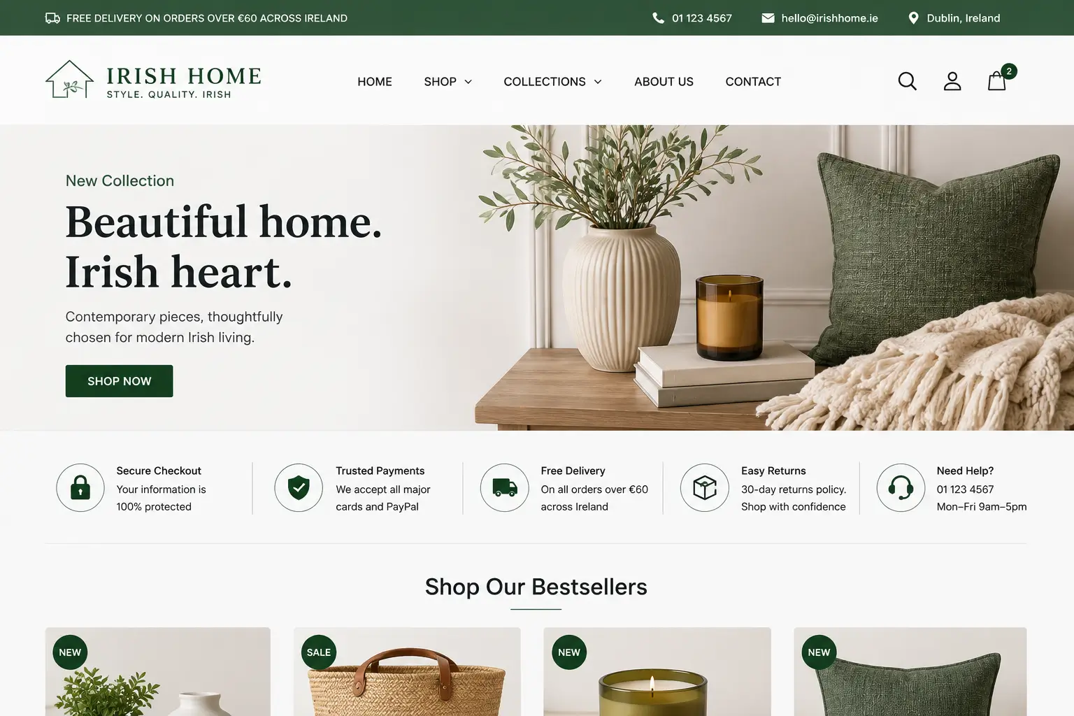
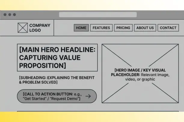
The area of your homepage visible before the user scrolls down - known as above the fold - needs to answer one question immediately: what does this business do and who does it serve? A strong value proposition is a concise headline, a supporting sentence or two, and a primary call-to-action button. That is it.
Where most businesses go wrong is writing headlines that describe how they feel about their work rather than what the visitor gets. "Passionate about property" tells a visitor nothing. "Residential conveyancing in Dublin, completed in four to six weeks" tells them everything. Be specific. The more precisely you describe your service and your customer, the more confident your ideal client feels that they are in the right place.
There is a separate post on the Web Wizard blog that goes into this topic in depth. If you want to understand exactly how the above-the-fold section influences whether a visitor stays or leaves, read this guide to above-the-fold design for a detailed breakdown.
Navigation That Works for Your Visitor, Not Your Org Chart
Navigation is often structured around how a business thinks about itself internally rather than how a customer thinks about what they need. Five to seven clearly labelled top-level items is the practical ceiling. Beyond that, users start to feel overwhelmed and often abandon the menu entirely.
Label things plainly. "Services" is fine. "Solutions" is not - it sounds like corporate speak and tells the visitor nothing. "About", "Contact", and a primary CTA button in the top right are all standard and should stay standard. Trying to be clever with navigation labels almost always reduces engagement. Users do not want to have to interpret what your menu means.
Social Proof That Feels Real
Trust is earned quickly or not at all on a homepage. Testimonials, Google review ratings, case study thumbnails, and client logos all serve as proof that your business has done this before and done it well. The key word here is "real". Real names, real photos where available, and specific outcomes carry far more weight than generic praise like "great service, highly recommend".
If you have Google reviews, embed a widget or display your star rating prominently. A 4.8-star rating from 40 verified reviews is a more powerful trust signal than a slick design. For service businesses in Ireland, where word of mouth has traditionally driven most new work, online social proof is essentially digital word of mouth.
Is Your Homepage Helping or Hurting Your Business?
Get a free homepage review from Web Wizard. We will tell you exactly what to fix, what to keep, and what is costing you enquiries right now.
One Primary Call to Action, Used Consistently
Every homepage needs a primary call to action - the one thing you want most visitors to do. For most Irish service businesses that is either "Get a Quote", "Book a Consultation", or "Call Us". The mistake is diluting that primary action with too many alternatives of equal visual weight. If everything looks equally important, nothing is important.
The primary CTA button should appear in the hero section, again somewhere in the middle of the page, and once more near the footer. Repeating it is not pushy - it is practical. Users scroll at different depths, and many will be ready to act well before they reach the bottom of the page.
A Services or What We Do Section
After your value proposition has established what you do at a high level, visitors need to understand the specifics. A brief services section - typically three to six short tiles or paragraphs - gives them a menu of what is available and links to the relevant service pages for more detail. Keep these descriptions outcome-focused. Not "WordPress development" but "websites built on WordPress that you can update yourself without needing a developer".
A Trust-Building About or Team Section
People buy from people. A brief section showing the face behind the business, with a human description of how you work and why you started the business, dramatically improves credibility - particularly for sole traders and small agencies where the relationship with the owner is part of the product. This does not need to be a full biography. Two or three honest sentences and a professional photo is enough.
Contact Information That is Easy to Find
This sounds obvious, but a surprising number of business homepages bury the phone number in the footer or make the "Contact" page the only way to get in touch. A percentage of every page's visitors are already ready to convert. Put your phone number, email, or booking link somewhere visible without scrolling - ideally in the header and in the main body of the page.
Homepage Design Elements to Remove Right Now
Knowing what to take off your homepage is as important as knowing what to add. Several very common design choices actively reduce conversions, and yet they persist because they feel safe or because they were fashionable years ago.
Image sliders and carousels are the biggest offender. Research consistently shows that users almost never interact with anything past the first slide - and the movement itself can distract from the primary message and slow the page down. Replace a carousel with a single, well-chosen hero image and a strong headline, and you will almost always see improvement.
Social media icons in the header are another problem. If a visitor clicks a social media icon from your homepage, they leave your website and enter an environment designed to keep them scrolling. If you must include social links, move them to the footer where they do less damage.
Generic stock photography is perhaps the most trust-eroding element on many Irish business websites. Visitors recognise the same smiling office workers and handshakes used by thousands of other businesses. Real photos of your team, your premises, or your work are not just more authentic - they perform better. A client of a local accountancy firm once told me the first thing they noticed on the firm's website was that the "team photo" showed people who clearly did not work there. They went elsewhere.
Vague introductory paragraphs that say nothing should also go. Sentences like "At ABC Plumbing, we pride ourselves on delivering exceptional service to our valued customers across the greater Dublin area" are completely weightless. Replace them with something specific: the number of jobs completed, a named area you serve, or a concrete outcome your customers care about.
Homepage Speed and Mobile Performance
In 2026, a homepage that loads in over three seconds on mobile is a homepage that is losing visitors before they see a single word of your content. Google has used mobile-first indexing since 2019, which means it primarily evaluates the mobile version of your page when deciding where to rank it. A slow, poorly optimised mobile homepage damages both user experience and search visibility at the same time.
The most common causes of slow homepage loading are oversized images that have not been compressed or converted to modern formats like WebP, third-party scripts that block rendering (chat widgets, analytics tools, outdated plugins), and poor hosting infrastructure. You do not need to understand the technical detail - but you should run your homepage through Google PageSpeed Insights and pay attention to your mobile score. Anything below 70 warrants a conversation with your developer.
On mobile specifically, your navigation menu needs to collapse cleanly, your CTA buttons need to be large enough to tap without errors, and text must be readable without the user pinching to zoom. These are not optional niceties - from June 2025, the European Accessibility Act imposes requirements on many Irish businesses to ensure their websites are accessible to users with disabilities. Mobile usability and accessibility now overlap significantly.
Homepage SEO: What Needs to Be Right From the Start
Your homepage is typically the strongest page on your domain from an SEO perspective, because it attracts the most inbound links and carries the most authority. This makes it the best candidate for ranking for your primary brand and service keywords. But that authority is wasted if the basic on-page SEO is not set up correctly.
The page needs a single H1 heading that includes your primary keyword - typically your main service and location. Something like "Web Design Dublin | Professional Business Websites" or "Plumbing Services Westmeath | Emergency and Planned Work". The meta title (what appears in Google search results) should be written for both the algorithm and the human who is deciding whether to click - it is not just a technical field.
Your meta description, the short summary below the search result, does not directly affect rankings but heavily affects click-through rate. Write it as a brief pitch for why your page is the right result. Include your primary keyword, and end with an action phrase. If you need help making sure your homepage is properly optimised for search, the SEO service at Web Wizard covers everything from on-page fundamentals to local SEO strategies for Irish businesses.
Internal links on the homepage also matter. Linking clearly from the homepage to your core service pages distributes authority across the site and helps Google understand your site structure. Every service you offer should be reachable from the homepage in two clicks or fewer.
A Homepage Design Checklist for Irish Business Owners
| Element | What Good Looks Like | Priority |
|---|---|---|
| Value proposition headline | Specific, outcome-focused, visible above the fold | Critical |
| Primary CTA button | Single clear action, repeated 2-3 times down the page | Critical |
| Navigation menu | 5-7 clear labels, no jargon, CTA in top right | Critical |
| Social proof | Real testimonials, Google star rating, client logos | High |
| Services overview | 3-6 outcome-focused descriptions, linked to service pages | High |
| Contact details visible | Phone and/or email in header and body, not just footer | High |
| Mobile performance | PageSpeed mobile score above 70, touch-friendly layout | High |
| SEO meta title and H1 | Primary keyword in H1, compelling meta title and description | High |
| Real team or founder photo | Authentic photo with brief human description | Medium |
| Blog or resources section | Optional, but adds credibility and encourages exploration | Low |
Comparing Website Designers? See Why We're Different
Custom Web Design Starting at €1,500 | No Hidden Fees | Free Consultation | Custom, SEO-ready site in 4 weeks (not 12-16)
Common Mistakes That Undermine an Otherwise Good Homepage
Trying to Speak to Everyone at Once
A homepage that tries to appeal to every possible visitor type ends up resonating with no one. If you serve both residential and commercial clients, or both job-seekers and employers, you need to make a choice about who your homepage speaks to primarily - and create separate landing pages for the secondary audience. Trying to do both equally on one page produces vague, unfocused copy that converts poorly.
No Clear Visual Hierarchy
When everything on a homepage looks equally important - similar font sizes, similar button weights, similar colour intensity - the user has no visual cue for where to look first. Good homepage design uses contrast, size, and spacing deliberately to direct the eye toward the most important elements first. If your designer cannot explain why each element is the size it is, that is a problem.
Writing the Homepage for the Business Owner, Not the Visitor
It is natural to want to lead with your business's story, your years of experience, or your awards. But visitors arrive at your homepage with their own problem, not an interest in your history. Lead with what the visitor gets, not with what you have done. Your "About" page is the right home for your story. The homepage is where you should be answering the question: "Is this the right place for me?"
Neglecting the Homepage After Launch
This is possibly the most common and most costly mistake. A homepage that was well-designed in 2021 may now have outdated testimonials, broken links, services you no longer offer, or pricing that no longer reflects reality. Homepages need to be reviewed at least twice a year. Set a reminder. Run a quick test with someone who has never seen your site and ask them to describe your business from the homepage alone. Their answer will tell you everything you need to know.
Ignoring Analytics
If you do not know your homepage's bounce rate, average scroll depth, or CTA click-through rate, you are making design decisions based on personal preference rather than evidence. Google Analytics 4 and Microsoft Clarity (which includes heatmaps and session recordings for free) give you clear data on how real visitors behave on your homepage. Use them. A high bounce rate combined with a low scroll depth usually means the value proposition is not landing. High scroll depth with low CTA clicks usually means the call to action placement or copy needs work.
How to Know If Your Homepage Is Actually Working
There are a few practical tests worth running before you invest in a redesign. First, the five-second test: show your homepage to someone who has never visited your site, let them look at it for five seconds, then ask them to describe your business. If they cannot name your service and your target customer accurately, your value proposition needs attention.
Second, look at your page analytics. If your homepage has a bounce rate above 70% and your average session is under 30 seconds, visitors are not finding what they expected. That could be a mismatch between what your Google listing promises and what the homepage delivers, or it could be that the page simply does not give visitors a reason to stay.
Third, check the mobile experience yourself. Pick up your phone, load your homepage on a mobile connection, and time how long it takes. Then scroll through the page and ask whether the experience feels designed for a small screen or just shrunk to fit one. A lot of Irish business websites fail this test badly, and the owners have simply never looked at it this way.
For a deeper look at the factors that separate a homepage that generates leads from one that simply exists, the guide on what makes a high-converting business website in Ireland covers the full picture across all pages, not just the homepage.
Your Homepage Should Work as Hard as You Do
Getting your homepage right is not a one-time task - it is an ongoing part of running a business online. The fundamentals covered in this guide - a specific value proposition, a single clear call to action, real social proof, fast mobile performance, and clean SEO basics - are the same regardless of your industry or the size of your business. Nail these and your homepage becomes an asset that consistently brings in new enquiries rather than a digital business card that passively exists.
If you are planning a new website or feel your current homepage is not performing the way it should, the team at Web Wizard would be happy to take a look. Our website redesign service starts with an honest review of what is and is not working - no obligation, no hard sell. Get in touch through the contact page and we will go from there.