Introduction
Why Generic E-Commerce Guides Leave Irish Businesses Behind
Most guides on ecommerce website design in Ireland give you the same advice: pick a platform, upload your products, add a payment method, and go live. That checklist might get a store online, but it will not make it sell. The difference between an online shop that generates consistent revenue and one that collects abandoned carts comes down to design decisions that most generic guides never address.
This guide is written from the perspective of an agency that has designed, built, and optimised e-commerce websites for Irish businesses across multiple sectors. You will not find vague advice about "making your website look professional" here. Instead, you will get a structured framework for building a store that earns trust, moves customers through a logical journey, and converts browsers into buyers.
Whether you are planning your first online store or rebuilding one that is underperforming, every section below will answer a single question: why does this decision matter to your sales?
The E-Commerce Website Framework: 5 Core Pillars
A successful e-commerce website is not a collection of pages. It is a system with five interdependent components, each one affecting the others. Understanding how they relate is the foundation of every strategic decision you will make.
| Pillar | What It Covers | Primary Impact |
|---|---|---|
| 1. User Experience | Navigation, customer journey, information architecture | Reduces drop-off before product pages |
| 2. Visual Design | Brand identity, imagery, typography, layout hierarchy | Builds trust within seconds of landing |
| 3. Product Pages | Descriptions, photography, pricing, social proof | Drives the decision to add to cart |
| 4. Checkout and Payment | Checkout flow, payment options, error handling | Completes the sale or loses it at the last moment |
| 5. Technical Performance | Page speed, mobile responsiveness, Core Web Vitals | Determines whether Google shows you and whether visitors stay |
Each pillar has a specific job. A store can have excellent product photography and still convert poorly if the checkout is confusing. It can load in under a second and still fail to sell if the product descriptions do not answer the right questions. The framework only works when all five pillars are addressed together.
Irish e-commerce businesses often invest heavily in one area, typically design, while neglecting checkout or page speed. The sections below will show you what each pillar requires and how to get it right from the start.
Pillar 1: User Experience and Customer Journey Mapping
Before a visitor can buy from you, they need to find what they are looking for without friction. User experience design is about removing every unnecessary step, question, and moment of hesitation between arriving on your site and completing a purchase.
The customer journey for most e-commerce stores follows five stages: awareness, interest, evaluation, purchase, and retention. Your website design needs to serve each stage. Most stores only design for the middle three, which is why they lose customers at both ends.
Navigation Architecture
Your navigation should reflect how customers think about your products, not how your warehouse or supplier organises them. If you sell clothing, customers think in terms of occasion, gender, and product type, not SKU categories. Category labels should match the language your customers actually use when searching.
Limit primary navigation to five to seven categories. Every additional item beyond that creates cognitive load and slows the decision to click. Use mega menus only if you have more than ten subcategories and you have tested that customers find them useful rather than overwhelming.
Internal Search
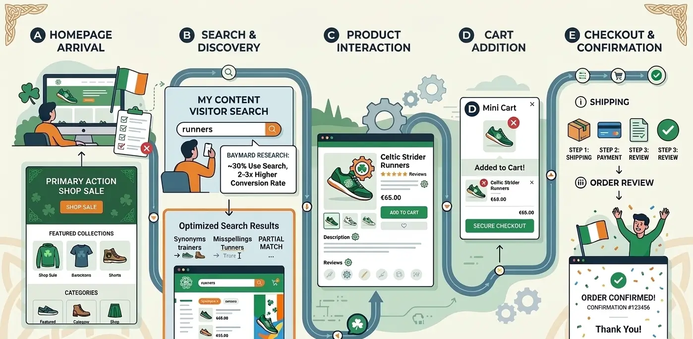
Customers who use your site search are typically high-intent buyers. According to research by the Baymard Institute, up to 30% of e-commerce visitors will use the search function on any visit, and these visitors convert at a rate two to three times higher than those who browse. If your search returns poor results or no results for near-matches, you are actively losing your most motivated visitors.
Configure your search to handle common misspellings, partial matches, and synonyms. If you sell "trainers" and someone searches "runners", they should see the same results.
Your homepage should also have a clear hierarchy. One primary action above the fold: shop by category, view the current sale, or explore the featured collection. Do not give first-time visitors five equally weighted options. One clear starting point reduces paralysis and moves people forward.
Pillar 2: Visual Design That Builds Trust and Credibility
Visitors form a judgement about your website within roughly 50 milliseconds of landing on it. That judgement is not about your products. It is about whether your store looks like a legitimate business worth buying from. Visual design is trust infrastructure before it is anything else.
Colour, Typography, and Consistency
A coherent visual system signals that you have invested in your business. Inconsistent fonts, mismatched colours, and stock photography that clashes with your brand identity all create subconscious doubt in the buyer's mind. This is particularly important for Irish SMEs competing against larger retailers with established brand recognition.
Your colour palette should serve your conversion goals. High-contrast calls to action (your "Add to Cart" buttons, your checkout prompts) should stand out from the surrounding layout. If your primary brand colour is dark navy, your primary action button needs to be something visually distinct: a warm amber, a bright green, or a strong white on navy. Buttons that blend into the page do not get clicked.
Photography Standards
Product photography is the single most underinvested area in Irish e-commerce. Blurry images, inconsistent backgrounds, and a lack of contextual shots are among the most common reasons visitors do not add products to their cart. You are asking someone to spend money on something they cannot touch. Your photography has to do the work that a physical product does in a shop.
Every product should have a minimum of three images: a clean white or neutral background shot, a detail or close-up shot, and a contextual or lifestyle shot that shows the product in use. If budget allows, a short product video on high-value items will increase conversion rates significantly.
Trust Signals
Trust signals should appear consistently throughout your store, not only on the homepage. Secure payment badges, return policy summaries, customer review counts, and "in stock" or "ships today" indicators all reduce purchase hesitation. These are not decorative elements. They are conversion tools, and their placement matters. Position them near your add-to-cart button, in your cart summary, and at the point of checkout.
Pillar 3: Product Page Optimisation for Conversions
Your product page is where the sale is won or lost. Every other page on your site exists to deliver a motivated visitor to this page. What happens here determines your conversion rate more than any other single factor. This is why image optimisation is very important
Product Page CRO Checklist
| Element | Required Standard | Common Failure |
|---|---|---|
| Product title | Clear, descriptive, keyword-aligned | Generic internal name or SKU code |
| Photography | 3+ images, high resolution, zoomable | Single supplier image, low resolution |
| Price and savings | Prominent, with the original price shown for sales | Price buried below the fold |
| Add to cart button | High contrast, above the fold, single clear action | Multiple competing CTAs, poor contrast |
| Description | Benefits-led, answers buyer objections, scannable | Supplier spec sheet copy-pasted verbatim |
| Reviews | Visible count and average near the product name | Reviews hidden at bottom of page or absent |
| Stock status | Explicit: "In Stock", "Only 3 Left", "Ships Today" | No stock indicator shown |
| Variants | Visual swatches for colour, clear size selectors | Dropdown menus for colour options |
| Cross-sells | "Frequently bought with" section below the fold | Absent entirely or showing irrelevant products |
| Delivery information | Explicit delivery timeframe and cost on the page | Visitor must navigate to FAQ to find delivery info |
Writing Product Descriptions That Convert
Most product descriptions on Irish e-commerce stores are either empty, duplicate the supplier's spec sheet, or describe features without ever translating them into benefits. A feature is what the product does. A benefit is why that matters to the buyer.
Lead with the benefit, support it with the feature, and close with a sensory or emotional detail. For a waterproof jacket: "Stays dry on the wettest days (20,000mm waterproof rating) with a breathable lining that prevents overheating on the trail." That structure works. "Waterproof rating: 20,000mm. Material: Gore-Tex. Weight: 340g." does not convert.
Let's Walk You Through An Example
Fictional Case Example: Lakeview Homewares, a fictional Galway-based homeware retailer, rewrote 40 product descriptions on their top-selling candle and diffuser range, switching from spec-led to benefit-led copy. Average time on product pages increased from 42 seconds to 1 minute 18 seconds, and the add-to-cart rate on the rewritten products improved by 22% over the following four weeks. Product photography was unchanged.
Pillar 4: Checkout Process and Payment Integration
Cart abandonment rates across e-commerce typically sit between 65% and 75%. The majority of those abandonments happen because the checkout process creates friction: too many steps, unexpected costs, limited payment options, or a layout that does not feel secure. Your checkout design has one job: remove every possible reason for a customer to stop and reconsider.
Checkout Flow Principles
Keep your checkout to three steps or fewer: contact details, delivery, and payment. Every additional step is a point where customers leave. If your platform allows a single-page or two-step checkout, use it. Display a clear progress indicator so customers know exactly where they are in the process.
Show the order summary persistently throughout checkout. Customers who cannot see what they are buying at any point in the flow feel uncertain. Uncertainty leads to abandonment. A persistent cart summary on the right side of desktop checkout is standard practice for this reason.
Payment Options for Customers
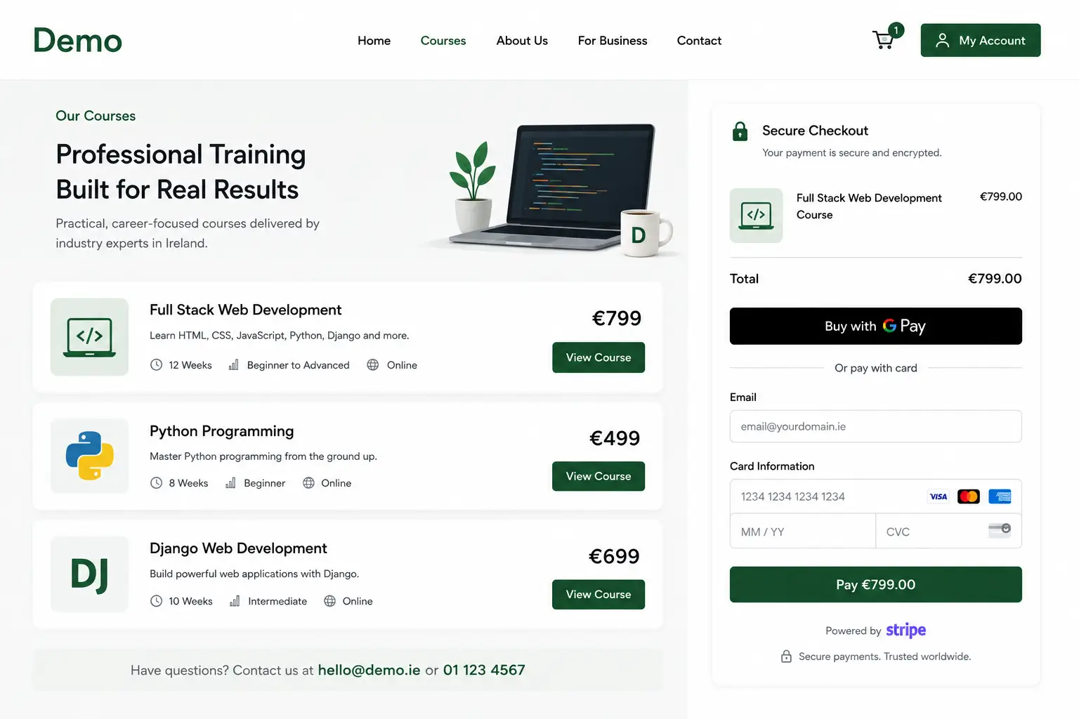
Irish consumers expect a range of payment options. At a minimum, your store should accept Visa, Mastercard, and American Express. Beyond that, Apple Pay and Google Pay are now expected by a large share of mobile shoppers: offering one-tap payment at checkout can increase mobile conversion rates meaningfully. PayPal remains relevant for customers who prefer not to enter card details.
For our ecommerce website development projects, we configure Stripe as the primary payment gateway. Stripe supports 3D Secure 2 authentication, which is required for compliance with EU Strong Customer Authentication rules, and handles Apple Pay and Google Pay natively without additional plugins. It also provides the clean, professional checkout interface that customers associate with legitimate, trustworthy stores.
If you sell higher-value products, consider adding a buy-now-pay-later option such as Klarna or Clearpay. Studies from Shopify show that BNPL availability increases average order value by 20 to 30% on eligible purchases, as customers are more willing to buy the premium option when payment is spread over several instalments.
Pillar 5: Speed, Mobile Responsiveness, and Technical Performance
Page speed is not a technical nicety. It is a conversion rate factor and a ranking factor, and it has measurable financial consequences at every delay increment. Google's own data shows that a page load time beyond three seconds causes more than half of mobile users to leave before the page finishes loading.
Core Web Vitals and What They Mean for Sales
Google's Core Web Vitals measure three things: how quickly your largest visible content loads (Largest Contentful Paint), how quickly the page responds to the first user interaction (First Input Delay or Interaction to Next Paint), and how much the layout shifts during loading (Cumulative Layout Shift). Failing any of these three metrics affects both your search rankings and your user experience.
For Shopify stores, the most common causes of poor performance are unoptimised images, excessive third-party scripts (live chat, pop-up tools, review apps), and heavy theme files. Image compression, script management, and lazy loading for off-screen media are the three highest-impact interventions available without a platform change.
Mobile-First Design Is Not Optional
Mobile devices account for more than 60% of e-commerce traffic in Ireland. Designing your store for desktop and then adapting it for mobile is the wrong approach. Design for mobile first, then ensure the desktop experience is equivalently strong. This means touch-friendly button sizes (a minimum of 44 x 44 pixels), readable font sizes without zooming, single-column product grids on smaller screens, and a checkout flow where every input field and action is accessible without pinching or horizontal scrolling.
Ireland-Specific Considerations for E-Commerce Sites
International guides to e-commerce design almost never address the considerations specific to Irish businesses. These are not minor details. They affect your compliance obligations, your customer expectations, and how you price and present your products.
VAT and Pricing Transparency
In Ireland, consumer-facing prices must be displayed inclusive of VAT under the Consumer Rights Act 2022. Displaying prices exclusive of VAT and adding tax at checkout is a common mistake that damages trust and increases cart abandonment. Ensure your Shopify or WooCommerce tax settings are configured to display VAT-inclusive prices for all Irish customers.
If you sell across the EU, you are required to register for and collect VAT based on the destination country once your cross-border sales exceed the thresholds set under the EU One Stop Shop scheme. Your store platform and pricing display should be configured to handle this automatically.
GDPR and Cookie Consent
Every Irish e-commerce website must obtain explicit, informed consent before setting non-essential cookies. This means a properly configured consent management solution, not a banner that assumes acceptance by continued browsing. Your consent tool must cover analytics, marketing, and payment processing cookies, and visitors must be able to manage their preferences easily.
Domestic Shipping Expectations
Irish customers have been conditioned by Amazon, Asos, and Dunnes Stores online to expect next-day or two-day delivery. If your logistics cannot match that timeframe, be explicit and upfront about delivery windows rather than hiding this information in a FAQ. Offering free shipping above a threshold, typically somewhere between 40 and 60 euro for most Irish categories, consistently increases average order value as customers add items to qualify.
Payment Methods Specific to Ireland
Beyond standard card payments, Irish shoppers are increasingly comfortable with digital wallets. Apple Pay adoption in Ireland is among the highest in Europe due to iPhone market share. Google Pay is the equivalent on Android. Both should be enabled at checkout. Revolut, while not a direct payment gateway, has become a tool through which many Irish consumers prefer to pay: supporting Revolut's virtual card numbers through your standard Stripe or Shopify Payments integration covers this implicitly.
Common Design Mistakes That Kill Sales
The following mistakes appear repeatedly across Irish e-commerce websites of all sizes. Each one has a measurable negative effect on conversion rate.
Mistake 1: No Clear Value Proposition Above the Fold
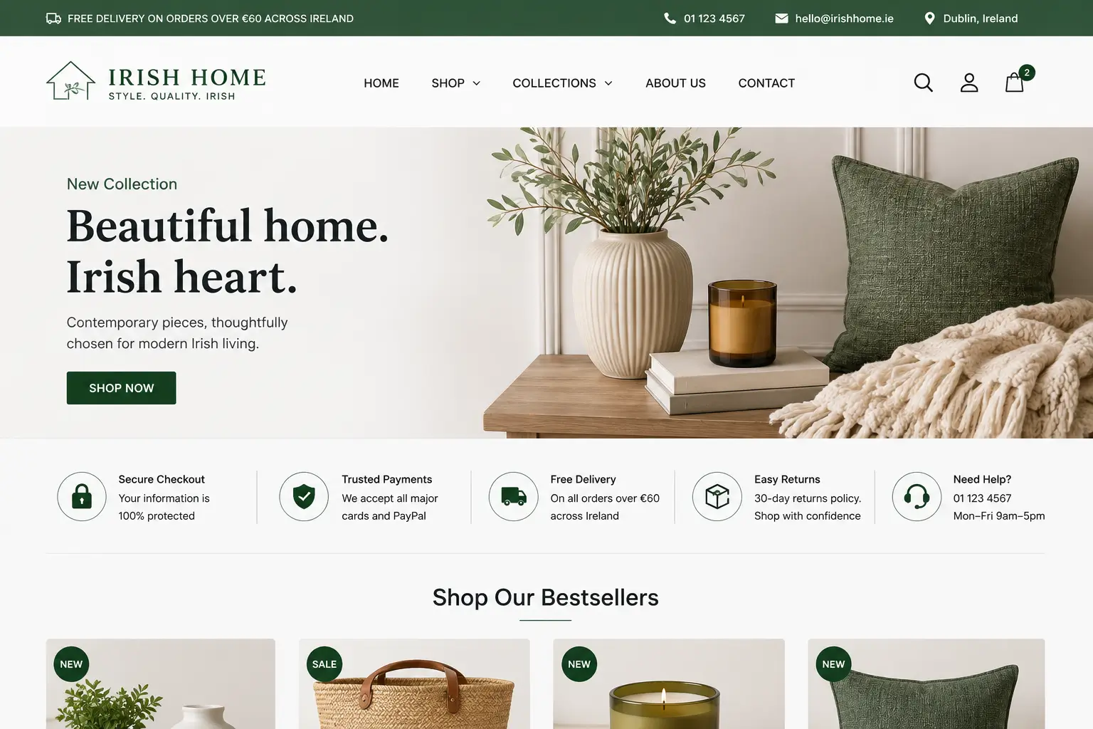
Your homepage has one job before the visitor scrolls: tell them what you sell, who it is for, and why they should buy from you rather than a competitor. Many Irish stores use their homepage hero section for a vague brand statement ("Quality Products for Every Home") or a purely visual banner with no text. A visitor who cannot immediately understand what you sell will leave. Test your homepage with someone who has never seen it. If they cannot describe your business accurately within five seconds, your value proposition needs work. Read - Common Web Design Mistakes That Could Be Hurting Your SEO
Mistake 2: Hiding Delivery Costs Until Checkout
Revealing shipping costs for the first time on the payment page is the leading cause of cart abandonment globally. If you charge for delivery, state it on product pages and in the cart. If you offer free delivery above a threshold, make that threshold visible throughout the shopping experience. Customers who are informed never need to be surprised, and it is surprise costs at checkout that trigger abandonment.
Mistake 3: Requiring Account Creation to Purchase
Forcing a first-time customer to create an account before completing their purchase adds friction at the most critical moment in the journey. Offer guest checkout by default. Prompt account creation after the order is confirmed, when the customer is in a positive mental state having just completed a purchase, rather than before, when they are still weighing up whether to commit.
Mistake 4: Product Pages With No Social Proof
A product page with no reviews, no star rating, and no indication of how many people have purchased the item is a significant conversion barrier. Social proof is not about having a five-star average. It is about demonstrating that real people have bought and found value in the product. Even a small number of honest reviews outperforms zero reviews in conversion tests consistently.
Mistake 5: Ignoring the Mobile Cart Experience
Many stores design beautiful mobile product pages and then deliver a cluttered, difficult cart experience on smaller screens. The cart page should make it easy to adjust quantities, remove items, apply discount codes, and proceed to checkout without confusion. If a customer cannot find the checkout button without scrolling three times, you will lose them.
E-Commerce SEO: Design Decisions That Rank
Search engine optimisation for e-commerce is not separate from design. The decisions you make about site architecture, URL structure, page speed, mobile experience, and content hierarchy directly affect how Google crawls, indexes, and ranks your store. Good ecommerce website design Ireland is by definition SEO-aware design.
Category Page Architecture
Category pages, not product pages, tend to be the highest-value organic landing pages in e-commerce. A well-structured category page ranks for broad product-type searches ("wireless headphones Ireland", "men's hiking boots Ireland") and channels that traffic down to individual products. Each category page needs a unique H1 title, a short introductory paragraph using the target keyword naturally, and a logical internal linking structure to subcategories and related collections.
Product Page SEO
Every product page should have a unique meta title and meta description. Do not use the default platform-generated titles (typically just the product name). Include the product name, a key attribute, and a brand or category reference in the title, and keep it under 60 characters. Avoid duplicate content across variant pages: if your product comes in six colours, use canonical tags to point all colour variants to the main product URL rather than creating six near-identical pages.
Site Speed and Core Web Vitals as Ranking Signals
Google confirmed Core Web Vitals as ranking signals in 2021. A store that scores poorly on Largest Contentful Paint and Cumulative Layout Shift will rank lower than a comparable store that scores well, all other factors being equal. For Irish e-commerce businesses targeting local search, where competition is typically less intense than national markets, strong technical performance is often the difference between page one and page two.
Structured Data for Products
Implementing product schema markup on your product pages enables Google to display rich results in search: star ratings, price, availability, and review counts shown directly in the search snippet. These rich results significantly increase click-through rates from search. Shopify includes basic product schema by default, but many themes implement it incompletely. Verify your schema output using Google's Rich Results Test before launching.
From Design to Launch: Your Implementation Roadmap
Designing an e-commerce website that converts is not a linear process, but it does follow a logical sequence. Skipping stages or reversing the order is the most common reason projects go over budget, miss launch dates, or launch with structural problems that require expensive rework.
- Discovery and audience research: Define your customer segments, map their purchase journey, and document the specific questions they have at each stage. This shapes architecture, content, and design before a single wireframe is drawn.
- Platform selection: Shopify is the right choice for most Irish product-based businesses due to its hosted infrastructure, payment gateway support, and app ecosystem. WooCommerce on WordPress suits businesses with complex customisation needs or tight integration with existing systems. Choose based on your operational requirements, not aesthetics.
- Information architecture: Design your category structure, URL hierarchy, and navigation before building. Changing this after launch is costly and can disrupt existing SEO equity.
- Design and UX prototyping: Build wireframes and visual mockups before writing a line of code. Test the checkout flow, navigation, and product page layout on mobile before proceeding to development.
- Development and integration: Build to the approved design. Configure payment gateways, shipping rules, and tax settings. Implement analytics, heatmapping tools, and cookie consent at this stage, not as an afterthought.
- Pre-launch testing: Test every user path on iOS and Android. Complete a checkout with each payment method. Verify that VAT is calculated correctly, delivery rates are applied accurately, and all confirmation emails are triggered and formatted correctly.
- SEO and speed audit before launch: Run Core Web Vitals checks, confirm meta titles and descriptions are set on all key pages, verify schema markup outputs correctly, and submit your sitemap to Google Search Console on the day of launch.
If you are planning to build or redesign an online store, our web design services cover each of these stages as part of a single, structured engagement rather than a series of disconnected deliverables.
When to Bring in Professional Help Rather Than Building It Yourself
DIY e-commerce platforms have made it possible for anyone to put a store online. That is genuinely useful for testing product ideas and validating demand at low cost. The point at which DIY becomes a liability is when you need consistent revenue rather than occasional sales: when the gap between traffic and conversion is costing you more than professional help would, or when you want to ensure you do not lose your SEO during the redesign of the website.
If your store is live, receiving traffic, and converting at less than 1.5%, the problem is almost certainly not the products. It is a structural design, trust, or checkout issue that a proper technical and strategic audit will identify and resolve. The stores we have redesigned for Irish businesses consistently see conversion rate improvements of 40 to 100% within the first trading period after relaunch, not because we change what they sell, but because we change how the store presents and closes the sale.
If you are ready to build an online store that sells consistently, we would be happy to discuss your project. Get in touch for a no-obligation conversation about what your specific business needs from an e-commerce website.