Introduction
Seven out of ten people who add something to your basket never buy it. That is not a rounding error - it is the reality of running an online store in Ireland in 2026. The average cart abandonment rate sits at just over 70%, and for mobile shoppers, it climbs closer to 85%. If your checkout is losing customers at that rate, no amount of traffic growth will save you.
The good news is that most cart abandonment is not random. It happens for predictable, fixable reasons - and the majority of them are rooted in how your checkout is designed, not in whether the customer actually wanted to buy. This guide walks through the specific checkout design changes that reduce cart abandonment, explains why each one matters, and shows you what a well-structured checkout actually looks like for an Irish ecommerce store.
Why Irish Shoppers Abandon Their Carts
Reducing cart abandonment starts with understanding what causes it. Research from Baymard Institute and Ireland-specific data from Elavon consistently point to the same culprits, in roughly the same order.
Unexpected costs at checkout are the single biggest driver. Nearly half of all abandonments happen because a shopper reaches the payment page and sees delivery fees, VAT, or other charges they did not expect. If your product pages show one price and your checkout shows a higher total, you have already lost the sale. Irish consumers are particularly sensitive to this because cross-border shopping is common, and people have learned to check totals carefully before committing.
Forced account creation is the second major culprit. Around a quarter of shoppers will abandon a checkout rather than create an account. This is not laziness - it is a reasonable response to a frustrating experience. Nobody wants to hand over their email address, verify it, set a password, and confirm their date of birth just to buy a candle. Guest checkout should be the path of least resistance, always.
After those two, the reasons become more varied: slow page load speeds, too many form fields, a checkout process that feels unsafe, limited payment options, and a cart page that does not work properly on mobile. Each of these is worth addressing, and most of them are straightforward to fix.
Explore our Website Design Dublin services or get in touch for a no-obligation conversation about what your store needs.
Checkout Design Fixes That Actually Reduce Cart Abandonment
The following changes are not theoretical. They reflect what consistently moves the needle on conversion rates for ecommerce stores across a range of sectors.
Show the Full Price Before Checkout
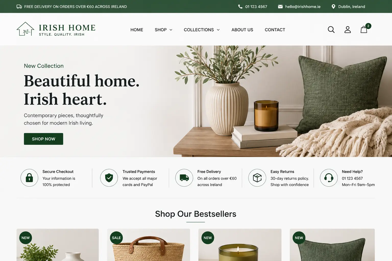
Pricing transparency is the fastest way to reduce cart abandonment. Your cart page should show the delivery cost, any applicable VAT, and the final total before the customer clicks through to checkout. If delivery is free above a threshold, state that clearly on the product page and the cart. If it varies by location, give an estimated range or use a simple postcode lookup tool. The goal is that there should be no surprises on the payment page - because surprises kill sales.
Some stores worry that showing delivery costs early will put people off. It might, occasionally. But the alternative - hiding costs until the last step - results in a far higher abandonment rate and creates a negative brand impression. An honest price shown early is better than an unexpected one shown late.
Make Guest Checkout the Default
If your checkout forces account creation before payment, change it today. Guest checkout should be the first and most prominent option on your checkout page. You can still offer account creation as an optional step after the purchase is complete - most well-designed checkout flows do exactly this. The customer has already bought, the trust is established, and offering to save their details for next time feels like a convenience rather than a barrier.
Platforms like Shopify make this configuration straightforward. If you're on WooCommerce, it requires a single settings change. There is no good reason to force registration before payment.
Reduce the Number of Form Fields
Every additional field in your checkout form is a small piece of friction that compounds over time. Ask yourself whether you genuinely need each field you collect. Date of birth is almost never required for a standard product purchase. Phone number can usually be optional. Company name only matters if you are selling to businesses. The fewer fields a customer has to fill in, the faster they move through checkout - and speed reduces abandonment.
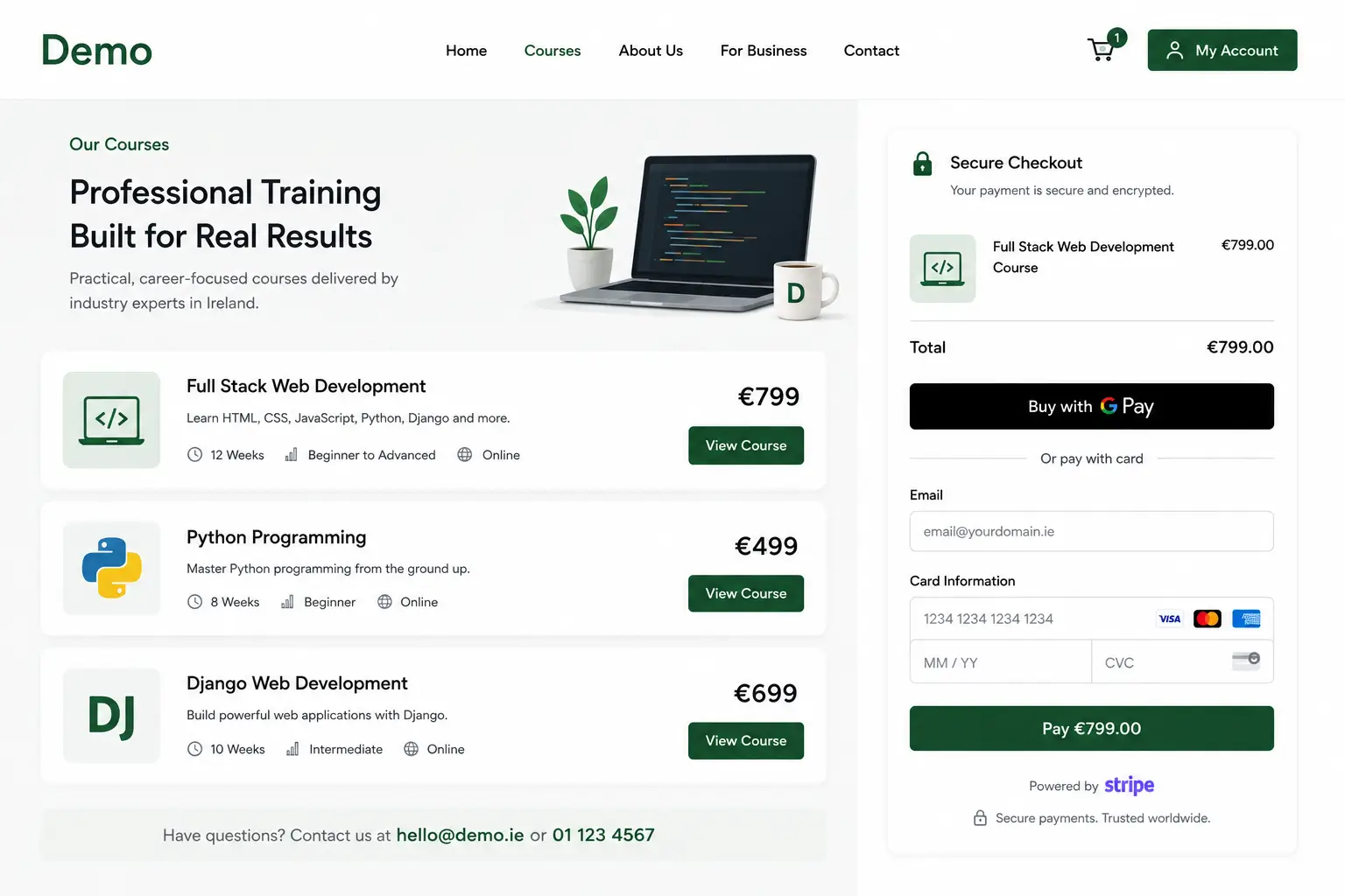
For returning customers, auto-filling saved addresses through browser autofill or stored account details makes a real difference, particularly on mobile where typing is slower. Apple Pay and Google Pay take this further: the customer authenticates once and the payment is done. For mobile shoppers, this alone can increase conversion meaningfully.
Add a Clear Progress Indicator
One of the quieter reasons people abandon checkout is that they do not know how long it will take. A simple three-step progress bar - "Details, Delivery, Payment" - sets expectations and reduces the anxiety of an unknown process. People are more willing to continue something when they can see how close they are to finishing it. This is a small design element with a measurable effect on completion rates.
Optimise Every Step for Mobile
If your checkout was designed on a desktop and never properly tested on a phone, you are losing a significant share of mobile sales. Common mobile checkout problems include buttons that are too small to tap accurately, input fields that open the wrong keyboard type (a numeric pad for a phone number field, a full keyboard for a postcode), dropdown menus that are difficult to use on a touchscreen, and a cart page that requires excessive scrolling to find the checkout button.
Test your checkout on a real phone, not just a browser emulation. Walk through the complete purchase process yourself. Note every moment of friction. Even experienced developers are often surprised by how poor the mobile checkout experience is when they actually try to use it as a customer would.
The Trust Problem: Why Customers Drop Off at the Payment Step
Some customers get all the way to the payment step and then stop. They want the product. They've accepted the price. But they hesitate at the point of entering their card details. This is a trust problem, and it is entirely solvable with the right design choices.
Security badges from recognised payment providers - Stripe, PayPal, Visa, Mastercard - reassure customers that their card details are handled safely. SSL certificates are the minimum expectation; displaying recognised payment logos adds a layer of visual trust that matters. Your returns policy should be visible on the checkout page, not buried in a footer link. Knowing that a return is straightforward makes the purchase feel lower risk.
For Irish stores selling to a primarily local audience, adding a phone number or live chat option on the checkout page can capture customers who have a last-minute question. This is particularly effective for higher-value purchases where the buyer wants reassurance before committing. A short, friendly "Need help? Call us on [number]" line within the checkout removes the final barrier for hesitant buyers.
Customer reviews also play a role here. If you can display a trust summary - "Rated 4.9/5 by 340 customers" - near the payment button, it reinforces confidence at the exact moment the customer needs it most.
Payment Options: What Irish Shoppers Expect in 2026
At minimum, your checkout should accept Visa, Mastercard, and American Express. In 2026, that is table stakes. What separates a well-optimised Irish ecommerce checkout from a basic one is the additional options you offer.
| Payment Method | Customer Benefit | Best For |
|---|---|---|
| Apple Pay / Google Pay | One-tap checkout, no card entry required | Mobile shoppers, high cart abandonment on mobile |
| PayPal | Familiar, trusted, no card details shared with store | Customers cautious about new brands |
| Klarna / Clearpay (BNPL) | Split payments, no upfront commitment | Higher-value purchases, fashion, electronics |
| Stripe Link | Saved card details across participating stores | Repeat customers, fast repeat checkout |
| Standard card (Stripe/Braintree) | Universal, fully controlled checkout experience | All store types as the core option |
Buy Now Pay Later (BNPL) options like Klarna are worth particular attention for Irish stores selling goods over €100. Research shows that BNPL availability increases basket size and reduces abandonment for mid-to-high value purchases, because it removes the psychological barrier of a large upfront payment. If your average order value is above €80-100, it is worth testing a BNPL integration.
If you are building or rebuilding your ecommerce store and want expert guidance on payment gateway setup, our Shopify ecommerce development service covers the full payment configuration process, including Stripe, PayPal, and BNPL integrations for the Irish market.
Losing Sales at Checkout? Let's Fix That.
Web Wizard builds high-converting Shopify and WooCommerce stores for Irish businesses. From guest checkout setup to mobile-first payment design - we handle it all.
Abandonment Recovery: What to Do After the Customer Leaves
Even with a perfectly optimised checkout, some customers will still leave. Life happens - they get interrupted, they want to think it over, they compare prices elsewhere. Recovery strategies bring a portion of those customers back, and for most Irish ecommerce stores, they represent easy, high-return wins.
Abandoned Cart Emails
An automated email sequence triggered by cart abandonment is the most widely used recovery tool and, when done well, consistently recovers 5-10% of abandoned sessions. The first email should go out within one to two hours of abandonment - while the product is still fresh in the customer's mind. It should show the abandoned items, link directly back to the cart, and ideally include a reassurance about your returns policy or delivery speed.
A second email 24 hours later can offer a small discount or free delivery code, but be careful about using this too readily - if customers learn that abandoning their cart generates a discount, you are effectively training them to do so. Save the discount email for carts you have not recovered with the first message.
Exit-Intent Popups
An exit-intent popup detects when a user is about to leave the checkout page - typically by moving their cursor toward the browser close button - and displays a message at that moment. Done poorly, these are annoying. Done well, they capture a final opportunity to address an objection: "Wait - did you know we offer free returns?" or "Your cart is saved. Come back any time." Short, relevant, and triggered only once per session.
Retargeting Ads
For stores with a meaningful ad budget, retargeting abandoned cart visitors through Google or Meta ads is an effective recovery channel. Seeing an ad featuring the exact product they almost bought - with a clear call to action - brings a measurable share of users back. This works best when the retargeting audience is properly segmented: a customer who reached the payment page is much closer to converting than one who only added to cart.
Explore our SEO Optimisation services in Ireland or get in touch for a no-obligation conversation about what your store needs.
Checkout Mistakes Irish Ecommerce Stores Keep Making
These are not hypothetical problems. They are patterns that appear repeatedly in ecommerce audits, and each one costs real sales.
Hiding Delivery Costs Until the Final Step
This is the most damaging checkout mistake and the most common. Some store owners believe that revealing delivery costs early will put customers off. What it actually does is delay the abandonment by a few steps and leave the customer with a worse impression of the brand. Show total costs early. If your delivery pricing is genuinely competitive, there is no reason to hide it.
A Checkout That Works on Desktop but Breaks on Mobile
Responsive design does not automatically mean a good mobile checkout experience. Form fields that are too small to tap, dropdown menus that do not behave properly on iOS, and a lack of one-tap payment options are all desktop-first oversights that are invisible to a developer testing on a screen and obvious to a customer trying to buy on their phone. Mobile commerce is the majority of traffic for most consumer-facing stores in Ireland. Test on mobile. Fix what you find. Learn more about The Importance of Mobile-First Design
Too Many Steps Between Cart and Confirmation
Some checkout flows add unnecessary steps: a "review your order" screen, a separate account creation prompt, a newsletter opt-in page before confirmation. Each additional screen is an exit point. A well-structured checkout should move from cart to payment in three screens or fewer. Anything beyond that needs a strong justification.
No Trust Signals Near the Payment Button
The payment step is where purchase anxiety peaks. A checkout page with no security indicators, no returns policy mention, and no recognisable payment logos forces the customer to trust on faith alone. That is too much to ask. Add security badges, a brief returns note, and recognisable payment provider logos to the payment screen. These take minutes to add and make a genuine difference to conversion rates.
Ignoring Checkout Speed
A checkout page that takes more than three seconds to load on a mobile connection will lose impatient shoppers. Page speed matters throughout your store, but it matters most at checkout, where the customer has already decided to buy and a slow page introduces doubt. Use Google PageSpeed Insights to test your checkout page specifically - not just your homepage - and address any critical issues. Unoptimised images, render-blocking scripts, and unminified CSS are the most common culprits.
If your checkout performance issues are rooted in your site's technical setup, our website maintenance and support service can carry out a full speed audit and implement the necessary fixes.
How to Measure Whether Your Changes Are Working
Reducing cart abandonment is not a one-time project - it is an ongoing process of testing, measuring, and improving. The key metric to track is your checkout completion rate: the percentage of sessions that reach the cart page and go on to complete a purchase. Set this up as a funnel in Google Analytics 4 by defining the steps from cart page to order confirmation. Once it is tracking, you will see exactly where in the checkout flow you are losing people.
Run one change at a time where possible. If you add guest checkout and reduce form fields simultaneously, you will not know which change had the bigger effect. Structured testing takes longer but gives you better information for the next round of improvements. Our post on conversion rate optimisation for Irish businesses covers the full testing framework in detail, including how to set up GA4 funnels and run meaningful A/B tests with limited traffic.
A realistic target for a well-optimised ecommerce checkout is a completion rate of 70-80% (meaning 20-30% abandonment at the checkout stage specifically, not counting people who browse without adding to cart). If you are significantly below that, there is work to do - and the fixes above will move you in the right direction.
Ready to Build a Checkout That Converts?
From Shopify setup to checkout UX - Web Wizard helps Irish online stores turn more browsers into buyers. Get a free, no-obligation consultation today.
If you are running an Irish online store and want a second pair of eyes on your checkout experience, we are happy to take a look. Get in touch with Web Wizard for a no-obligation conversation - we can identify the specific friction points in your checkout and recommend practical fixes that will make a real difference to your sales.