Introduction
Your website has about three seconds to convince a visitor they are in the right place. If the layout is confusing, the page takes too long to load, or the visitor cannot find what they came for, they leave. They do not come back. And in most cases, they go straight to a competitor.
User-friendly website design is not just about making things look clean. It is about how your site feels to use, how quickly it communicates value, and whether it removes every possible obstacle between a visitor arriving and them picking up the phone or filling in your contact form. For Irish small businesses and entrepreneurs, getting this right can be the difference between a website that generates consistent enquiries and one that simply sits online doing very little.
This guide covers the core UX design principles behind websites that actually convert, what Irish businesses most commonly get wrong, and what you should prioritise if you are building or redesigning a site in 2026.
What User-Friendly Website Design Actually Means
A user-friendly website is one where visitors can arrive, understand what the business does, find the information they need, and take a clear action - all without having to think too hard. That last part matters more than most people realise. Every extra decision a visitor has to make on your site increases the chance they abandon it.
In practical terms, a user-friendly website loads quickly, works on any device, uses clear language, is easy to read, and guides visitors naturally towards a goal. It is not about having the most impressive design. It is about having the most effective one.
For a small business in Ireland, the goal is almost always the same: generate enquiries, bookings, or sales. That means user-friendliness and conversion are not two separate things - they are the same thing. A site that frustrates users does not convert. A site that converts is, by definition, working well for its users.
The UX Principles That Drive Conversions
User experience (UX) design is the discipline behind how digital products feel to use. The principles that apply to large-scale software products apply equally to a five-page business website. These are the ones that matter most for Irish SMEs:
Clarity over cleverness. Visitors should understand what you do within seconds of arriving. Taglines like "We help businesses grow" tell nobody anything. "Website design for Irish trades and construction businesses" tells you exactly who it is for. Clear, specific language outperforms creative vagueness every time.
Consistency across pages. Buttons should look the same throughout. Navigation should stay in the same place. Heading styles should follow a clear hierarchy. When a site feels consistent, visitors feel confident. When it feels patched together, they start to question the professionalism of the business behind it.
Minimal friction. Every step between a visitor arriving and them contacting you is a potential exit point. Long forms, confusing navigation menus, pop-ups that appear immediately, and broken links all add friction. Reducing the number of steps and decisions a visitor has to make almost always improves conversions.
Navigation: The Foundation of a User-Friendly Website
Poor navigation is the single most common UX problem on small business websites in Ireland. It is also one of the easiest to fix. If visitors cannot find what they are looking for within a few seconds, they do not search harder - they leave.
A clear navigation structure should have no more than five or six items in the main menu. Each label should describe exactly what is behind it - not a creative name that sounds good to the business owner but means nothing to a new visitor. "Services" is fine. "What We Do" works. "Our World" does not tell anyone anything useful.
Dropdown menus should be used sparingly and only when genuinely needed. On mobile, they become difficult to use and often lead to accidental taps on the wrong item. If you have more than six service lines, consider whether they all need to be in the main navigation or whether some belong on a dedicated services page.
One thing that is consistently overlooked on Irish small business websites is the footer. A well-structured footer that includes key service links, contact details, and a clear address acts as a safety net for visitors who scroll past the main content looking for information. Do not make it an afterthought.
Mobile-First Design Is No Longer Optional in 2026
More than 60% of website traffic in Ireland now comes from mobile devices. If your website was designed primarily for desktop and then adapted for mobile, the experience on a phone is almost always second-rate. Text is too small, buttons are too close together, images break the layout, and forms are difficult to complete on a touchscreen.
Mobile-first design means building the site with the mobile experience as the starting point, then scaling up for tablet and desktop. The result is a site that works well on every device because it was designed that way from the beginning rather than retrofitted.
Google has used mobile-first indexing since 2019, which means it primarily crawls and ranks the mobile version of your site. A poor mobile experience does not just cost you conversions - it costs you organic traffic as well. The two are connected.
For Irish businesses in service industries, trades, or hospitality, the vast majority of visitors are on their phones when searching. A builder in Westmeath looking for a local accountant searches on their phone while on site. A shopper browsing for a gift browses on their phone on the couch. If your site does not work well on a phone, most of your potential customers are already having a bad experience before they read a word of your content.
Page Speed: How Loading Time Directly Affects Conversions
Page speed is a user experience issue before it is a technical one. Every additional second your page takes to load costs you visitors. Studies from Google show that as page load time increases from one second to three seconds, the probability of a user bouncing increases by 32%. By five seconds, that probability is 90%.
For Irish small businesses, the most common causes of slow websites are unoptimised images (photos uploaded straight from a phone or camera at full resolution), cheap hosting with poor server response times, and too many third-party scripts loading on every page. None of these are difficult to fix, but they require someone who knows what to look for.
Google's Core Web Vitals are a set of performance metrics that measure real-world user experience: how quickly the largest piece of content appears on screen (Largest Contentful Paint), how quickly the page responds to the first interaction (First Input Delay), and how much the layout shifts while loading (Cumulative Layout Shift). These scores directly influence search rankings. A slow site ranks lower, gets less traffic, and converts fewer of the visitors it does get.
Aiming for a Largest Contentful Paint under 2.5 seconds is a realistic target for most small business websites and should be treated as a non-negotiable baseline rather than a nice-to-have.
Visual Hierarchy and Readability: Getting Visitors to Actually Read Your Content
Most visitors do not read websites the way they read a book. They scan. They look at headings, bold text, images, and buttons to decide whether the page contains what they need before committing to reading any body text. If your page does not support this scanning behaviour, most of your carefully written content will go unread.
Good visual hierarchy means the most important information is largest, highest, or most visually prominent. Your H1 heading should tell the visitor exactly what the page is about. Subheadings should break the content into digestible sections that make sense when read in isolation. Key phrases can be bolded, but sparingly - bolding everything has the same effect as bolding nothing.
Font size matters more than most small business owners appreciate. A base font size of 16px is the minimum for comfortable reading on desktop. On mobile, 17–18px is often better. Small text that requires a visitor to zoom in is a trust and usability issue, not just an aesthetic one.
White space - the empty space around content - is not wasted space. It reduces cognitive load, makes pages easier to scan, and gives important elements room to breathe. Cluttered pages that try to fit everything above the fold nearly always convert worse than clean, spacious layouts that guide the eye naturally from one section to the next.
Accessibility in 2026: What the European Accessibility Act Means for Irish Businesses
From 28 June 2025, the European Accessibility Act became enforceable across all EU member states, including Ireland. This legislation requires that websites and digital services meet accessibility standards, particularly for businesses selling products or services to consumers.
Accessibility means building websites that work for people with visual, auditory, motor, or cognitive impairments. In practice, this includes providing sufficient colour contrast between text and backgrounds, ensuring all images have meaningful alt text, making sure all interactive elements are usable by keyboard navigation, and not relying solely on colour to convey information.
The Irish market has been slow to engage with accessibility as a business priority, but it is now a legal requirement for most commercial websites. Beyond compliance, accessible websites perform better on SEO because accessibility improvements - clean heading structure, descriptive alt text, logical reading order - overlap heavily with what search engines reward.
Our website accessibility checklist for Irish companies covers the practical steps businesses need to take to meet these requirements without a complete site rebuild.
Trust Signals: The UX Elements That Reduce Hesitation
A visitor arriving at your website for the first time knows nothing about you. Your design choices, the quality of your content, and the signals you include on your site are the only information they have to decide whether you are credible. Trust signals are the specific elements that answer the question: "Should I trust this business?"
For Irish small businesses, the most effective trust signals are: named customer reviews with a photo or business name (not anonymous testimonials), a clear physical address and phone number visible on every page, professional photography rather than stock images, any relevant industry memberships or certifications, and a clear privacy policy and GDPR-compliant cookie notice.
One thing that is often underestimated is the impact of showing the person behind the business. A headshot and a short biography from the founder or lead consultant builds personal trust in a way that corporate language never can. Irish buyers, particularly for service businesses, often want to know who they are dealing with before they pick up the phone. If your website hides this, you are making it harder to convert.
Want a Website That Earns Trust and Drives Enquiries?
Custom UX-focused Web Design Starting at €1,500 | Mobile-First | SEO-Ready | Free Consultation
UX Design vs Visual Design: Understanding the Difference
Many Irish business owners confuse a good-looking website with a well-designed website. The two are not the same. Visual design is about aesthetics: typography, colour palettes, photography, and brand identity. UX design is about how well the site works for the person using it. A beautiful website can still be a poor UX. A plain, simple website can convert at a very high rate.
The goal is for both to work together. Your site should look professional and reflect your brand well, and it should also be easy to use, fast to load, and structured around what your visitors are trying to do. When these are in conflict - for example, a designer wants a full-screen video header that looks impressive but slows the page significantly - the UX consideration should usually win. A visitor who never scrolls past your video does not convert regardless of how good it looks.
| UX Design Factor | What Good Looks Like | What Poor Looks Like | Impact on Conversions |
|---|---|---|---|
| Navigation | 5-6 clear menu items, descriptive labels | 10+ items, creative labels, deep dropdowns | High - directly affects bounce rate |
| Page speed | Loads under 2.5 seconds on mobile | 5+ seconds, layout shifts while loading | Very high - 1 extra second can reduce conversions by 7% |
| Mobile experience | Designed mobile-first, thumb-friendly | Desktop design squeezed onto a phone screen | Very high - 60%+ of Irish traffic is mobile |
| Readability | 16px+ font, clear hierarchy, ample spacing | Small fonts, no hierarchy, dense blocks of text | Medium - affects engagement and time on page |
| Trust signals | Named reviews, real photos, visible contact info | No reviews, stock photos, hidden contact details | High - visitors need to feel safe before enquiring |
| Accessibility | Sufficient contrast, alt text, keyboard navigation | Light grey on white text, missing alt tags | Medium - affects SEO and legal compliance from 2025 |
| Call to action | One clear primary CTA per page, visible without scrolling | Multiple competing CTAs, or no CTA at all | Very high - CTA placement is a direct conversion lever |
Common UX Mistakes Irish Business Websites Make
Putting contact details only in the footer
Visitors who are ready to enquire should not have to scroll to the bottom of every page to find your phone number. Your phone number and a contact link should be visible in the header on every page, particularly on mobile. Burying contact information is one of the most common conversion killers on Irish SME websites, and it is completely avoidable.
Using stock photography throughout
Generic stock images of suited professionals shaking hands or smiling at laptops communicate nothing specific about your business. Visitors recognise stock photography immediately, and it reduces trust. Real photographs of your premises, your team, or your work - even taken on a modern smartphone - are almost always more effective. Authenticity outperforms polish when it comes to trust.
Overcomplicating the navigation
The instinct to include every service, every page, and every section in the main navigation is understandable but counterproductive. A menu with twelve items forces visitors to read everything before making a choice, which is exhausting. Fewer, clearer options convert better. If you have extensive content, use a well-structured services page rather than trying to surface everything in the header.
Ignoring page speed as a design consideration
Page speed is treated as a technical problem to be fixed later, when in reality it is a design decision made early. Large hero images, autoplay videos, and decorative animations all add loading time. If your designer is not considering performance impact during the design phase, you will often end up with a site that looks good in a mockup but loads slowly in the real world. This is particularly damaging on mobile connections, which are still variable across rural Ireland.
No clear primary call to action above the fold
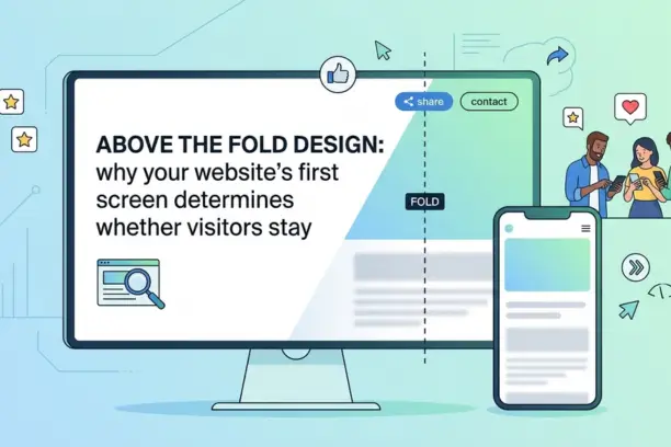
Every page on your site should have one obvious primary action you want the visitor to take. On a homepage, that might be "Get a Free Quote", "Book a Consultation", or "Call Us". If the visitor has to scroll before they see any invitation to act, you are already losing people who were ready to convert. The first screen of your website is prime real estate. Use it intentionally.
How to Audit Your Own Website's User-Friendliness
You do not need specialist tools to run a basic UX audit on your existing site. Start by opening your site on your phone and asking yourself honestly: how easy is this to use? Can you find the main service you offer within ten seconds? Is the phone number visible without scrolling? Does the page load quickly on a mobile connection?
Then ask someone who is not familiar with your business to try to complete a simple task on your site - finding a specific service, locating your contact details, or understanding your pricing. Watch where they hesitate or struggle. Those moments are your UX problems.
For a more structured review, Google's free PageSpeed Insights tool will give you a performance score for both mobile and desktop along with specific recommendations. The Core Web Vitals scores shown in Google Search Console are also worth monitoring if you have it set up for your site.
If your site was built more than three years ago without a redesign, the mobile experience is likely the weakest point. Our guide on how to redesign your website without losing SEO rankings walks through how to approach a redesign without undoing the search visibility you have already built or visit our Website Redesign Services.
Not Sure If Your Website Is Working Hard Enough?
Get a free website review from Web Wizard. We will tell you honestly what is working and what is costing you enquiries.
When User-Friendly Design Becomes a Revenue Issue
Small business owners often think of their website as a one-time cost rather than an ongoing commercial asset. But a site that converts 1% of its visitors into enquiries versus one that converts 3% is, in practical terms, three times as valuable - without any additional traffic or marketing spend.
If your website is getting reasonable traffic through organic search, social media, or word-of-mouth referrals, and you are not seeing a proportionate number of enquiries come through it, UX is almost certainly part of the problem. The solution is rarely more content or a new colour scheme. It is usually a combination of better navigation, faster loading times, clearer calls to action, and stronger trust signals.
This is why our web design service is built around conversion outcomes rather than deliverables. A site that looks good in a presentation deck is not the goal. A site that brings in more business is.
If your current website is not generating the enquiries your business deserves, the most likely explanation is not your product, your pricing, or your market. It is the site itself. Getting user-friendly website design right is not a luxury for larger businesses - it is the foundation that every other marketing and SEO effort builds on. If you are considering a new site or a significant update to an existing one, get in touch with the team at Web Wizard for a straightforward conversation about what your site needs.