Introduction
You have about three seconds before a visitor decides whether to stay on your website or leave. In that window, the single most important design element isn't your colour scheme or your hero image. It's your navigation.
Website navigation design shapes how visitors move through your site, how quickly they find what they need, and whether they ever make it to your contact or booking page. If someone can't immediately understand how to get from your homepage to the page they need, they won't try to figure it out. They'll just go.
This guide covers the practical decisions behind building navigation that works: how many items to include, how to structure menus by business type, what mobile navigation needs to do, and where most Irish business websites go wrong. Whether you're planning a new build or trying to work out why your current site isn't converting visitors into enquiries, sorting your navigation is often the highest-impact change you can make.
Why Website Navigation Design Directly Affects Conversions
Website navigation design refers to the system of menus, links, and signposting that tells visitors where they are and how to get to where they want to go. When navigation is clear and logical, visitors move confidently through your site. When it's confusing, cluttered, or unhelpful, they bounce, usually without you ever knowing why.
Research from the Nielsen Norman Group has consistently found that confusing navigation doesn't just frustrate users. It pushes them into a state of cognitive strain where they begin to question the credibility of the business itself. That's a meaningful finding for any Irish service business trying to build trust with a first-time visitor. Poor navigation doesn't just cause confusion - it actively erodes confidence in your company.
For a typical Irish SME website, navigation issues tend to show up in Google Analytics as high bounce rates on key landing pages, low time-on-site compared to industry benchmarks, or low conversion rates despite reasonable traffic. If any of those describe your current site, your navigation structure is worth examining before you spend anything on more traffic or advertising.
The good news is that navigation design is one of the more correctable problems. Unlike a poorly written homepage or a weak value proposition, fixing your menu structure rarely requires a full redesign. In most cases, it's a targeted set of changes that can be applied to an existing site.
How Many Items Should Your Website Menu Have?
This is the question we hear most often from clients planning a new site, and the answer is simpler than most people expect: aim for five to seven top-level items. No more, and ideally no fewer than four.
The reasoning comes from well-established cognitive science. When people face too many choices simultaneously, they take longer to decide - and in the context of a website, "longer to decide" almost always means "click away." Each additional item in your top-level menu adds friction, not helpfulness. This is sometimes called Hick's Law, and it applies directly to navigation design.
For most Irish service businesses, the core navigation structure is straightforward: Home (or just a logo link), Services, About, one supporting page such as Portfolio, Case Studies, or Blog, and Contact. That's five items, and honestly, it's enough. Anything beyond those categories belongs in subpages, footer links, or a well-structured dropdown rather than cluttering the main bar.
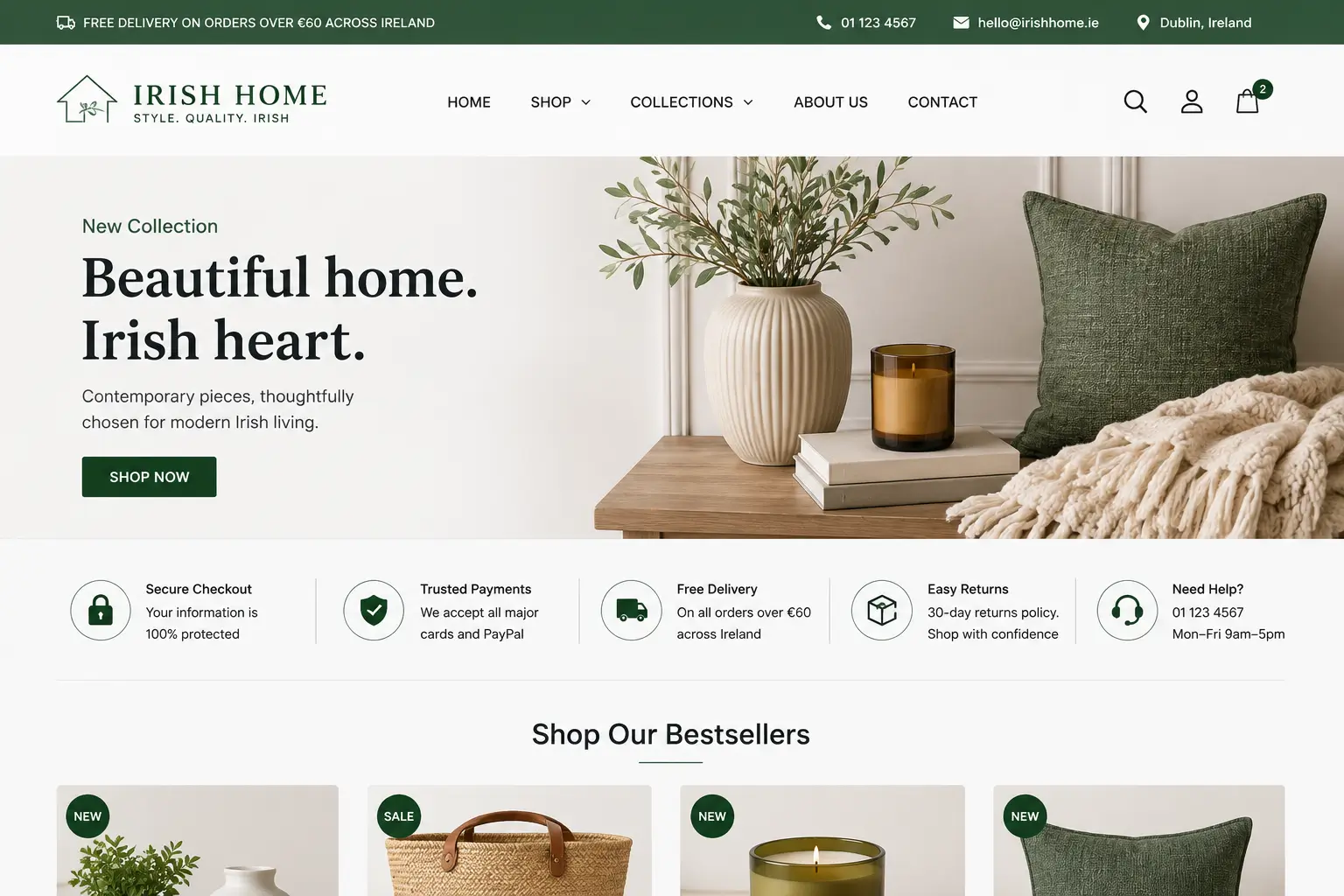
Ecommerce sites are a different story. If you're running an online shop with multiple product categories, a horizontal mega menu or organised dropdown structure might make sense. But restraint still applies: don't list every product category in the top-level navigation. Group items logically, keep labels descriptive, and let the dropdown carry the depth.
Structuring Your Navigation by Business Type
Not every Irish business needs the same menu structure. A plumber in Mullingar has different priorities to a healthcare clinic in Dublin, and both are different again from a Shopify store selling homeware. What works in one context can create confusion in another. The table below offers a practical starting point for the most common business types.
| Business Type | Recommended Top-Level Items | Primary CTA Button Text |
|---|---|---|
| Service business (trades, consultants) | Services, About, Testimonials, Contact | Get a Free Quote |
| Professional services (solicitors, accountants) | Services, About, Resources / Blog, Contact | Book a Consultation |
| Healthcare / Clinic | Services / Treatments, About, Team, Contact | Book an Appointment |
| Ecommerce store | Product categories (max 4-5), About, Contact | Cart icon + Shop Now |
| Education / Training | Courses, About, Testimonials, Blog, Contact | Enrol Now |
One principle applies to every business type: don't bury your most important page. The page that converts visitors, usually a Services or Contact page, should always be reachable in a single click from anywhere on the site. Never put it three levels deep in a dropdown submenu that most users won't bother expanding.
Is Your Website Navigation Costing You Enquiries?
Custom Web Design Starting at €1,500 | No Hidden Fees | Free Consultation | Custom, SEO-ready site in 4 weeks (not 12-16)
The Five Elements Every High-Converting Navigation Must Include
Most business websites in Ireland are missing at least two of these. Check your own navigation against this list before your next meeting with a developer or designer.
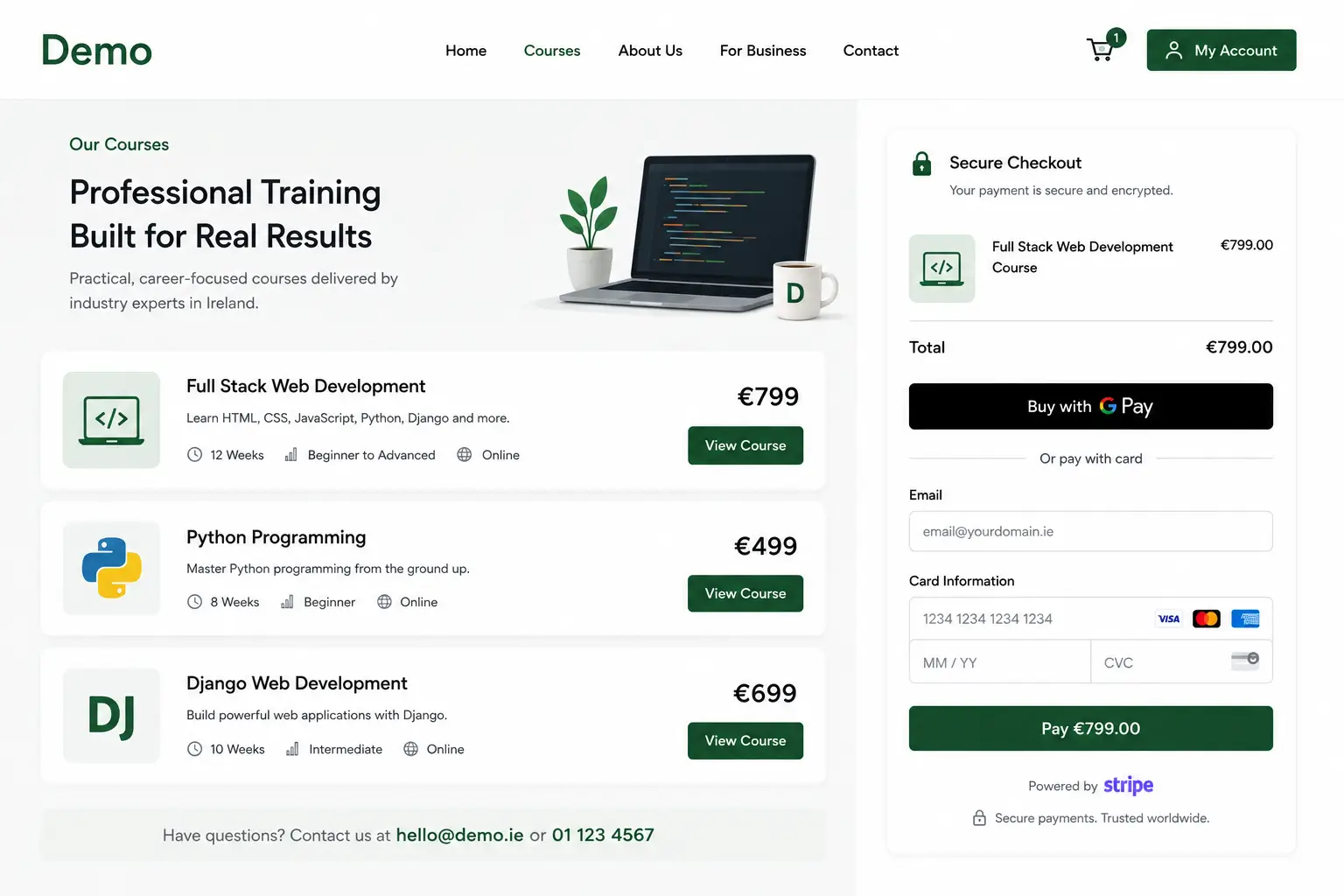
A prominent CTA button. This is probably the single biggest navigation gap on Irish SME sites. Your menu shouldn't just be a list of page links. It needs one clearly styled button that prompts action, something like "Get a Quote", "Book a Call", or "Contact Us". This button should stand out visually from the regular nav links, typically through a contrasting colour and a pill or rounded shape rather than a plain text link. If your navigation doesn't have one, you're leaving conversions on the table every day.
Clear, descriptive labels. Avoid anything that makes a visitor pause to interpret. "Our Solutions", "Discover", "Explore" - these sound impressive but communicate nothing to someone landing on your site for the first time. "Services", "Prices", "About Us", "Contact" are simple, obvious words that tell someone exactly what they'll get when they click. Use the language your customers actually use, not your internal company vocabulary.
Sticky navigation. A sticky header stays visible as visitors scroll down the page. This matters because not everyone reads from top to bottom. A visitor might spend 90 seconds reading through your services section before deciding to enquire. If your navigation has disappeared off the top of the screen by then, you've added an unnecessary barrier between them and your contact page. A sticky header is a small change that has a measurable impact on conversion.
A mobile-ready structure. More than half of Irish website traffic now arrives on mobile devices. A well-implemented hamburger menu keeps navigation accessible without dominating the screen. The menu icon itself needs to be large enough to tap comfortably, the expanded menu should be easy to close, and all links need enough spacing between them to hit accurately without zooming in.
Visual hierarchy. The most important pages should appear first, left to right in a horizontal bar or top to bottom in a mobile menu. Don't put "About Us" before "Services". Your highest-converting, most-visited pages belong at the front of the queue, where they're seen first and reached fastest.
Mobile Navigation Design: Where Most Irish Business Websites Go Wrong
A lot of Irish SME websites have mobile navigation that was clearly treated as an afterthought. The desktop version looks polished, but on a phone it becomes a mess of tiny tap targets, overlapping text, and menus that don't close properly. This matters beyond frustration: Google's mobile-first indexing means your mobile experience isn't just a usability issue. It's an SEO issue too.
The most common problem we see is dropdown menus that work fine with a mouse but fail on a touchscreen. On desktop, hovering over a nav item reveals a dropdown. On mobile, there's no hover state. If your dropdown only activates on hover, mobile users simply can't access those subpages. They see the top-level item but clicking it either loads a generic parent page or does nothing. Either way, the subpage they needed is effectively invisible.
The fix is straightforward but requires deliberate implementation: dropdowns on mobile should expand on tap, with sub-items listed below the parent in an accordion style. This keeps the structure logical and navigable on any screen size without requiring the user to swipe or zoom.
Another common issue is navigation links being too close together. Apple's Human Interface Guidelines recommend a minimum tap target of 44 x 44 pixels. If your mobile menu items are smaller than that, you're creating a frustrating experience for most of your visitors. This is a detail most business owners never check on their own sites, but it shows up clearly in bounce rate data from mobile visitors.
If you want to understand how mobile design connects to your overall website performance, our guide on user-friendly website design in Ireland covers the full picture of what makes a site work across devices.
Common Navigation Mistakes That Quietly Hurt Your Conversions
These are the patterns we see most frequently on Irish business websites, and the consequences are real and measurable.
Too many items in the top-level menu. Adding every page to the navigation feels thorough, but it creates visual noise that makes visitors less likely to click anything at all. If you have more than seven items in your primary menu, something needs to move into a dropdown or footer. More options don't make a site more useful. They make decisions harder.
Vague or branded labels that mean nothing to a stranger. "Our Journey", "The Hub", "Discover More" - labels like these are common on websites where someone internally got creative during the build. They make sense to the people who created them and to no one else. Use plain language that mirrors how your customers already talk about what they want: "Services", "Prices", "How It Works".
No CTA button in the navigation. This is probably the most common structural gap we see on Irish SME sites. The menu lists pages, but there's nothing that explicitly invites action. Adding a single "Get a Quote" or "Book a Consultation" button to the right end of your navigation header is one of the simplest high-impact changes you can make without touching the rest of your design.
Important pages hidden in dropdowns. Dropdown menus are useful for organising sub-pages, but if your most critical page - a Contact or Booking page - only appears inside a dropdown, many mobile users will never find it. Keep high-priority pages at the top level or make sure they're accessible via your CTA button regardless of where someone is in the menu structure.
Navigation that disappears when users scroll. A non-sticky header means that once a visitor has scrolled past the fold, your navigation is gone. If they decide mid-page that they want to enquire, they have to scroll all the way back up, and many won't bother. If your site doesn't already use a sticky header, it's worth implementing as a priority change during your next update cycle.
Ready to Build a Website That Actually Converts?
Custom Web Design Starting at €1,500 | No Hidden Fees | Free Consultation | Custom, SEO-ready site in 4 weeks (not 12-16)
How Navigation Structure Affects Your SEO
Website navigation design isn't purely a user experience concern. The way your menu is structured directly influences how Google understands and prioritises the pages on your site.
When Google's crawler visits your website, it follows links, including the links in your navigation. Pages that appear in your primary menu are treated as high-priority destinations. Pages buried deep in the site structure, accessible only through multiple clicks from non-prominent locations, receive less authority by default. This is one of the reasons that a well-designed navigation isn't only about usability. It's about ensuring your most important pages are given the best possible chance of ranking.
The internal linking created by your navigation also sends clear signals. If your Services page is linked from every page via the header, Google understands it as a significant page within your site. If the same Services page can only be found by following a chain of blog post links, Google may still find it, but it won't assign the same weight.
Breadcrumb navigation, which shows users their path through a site (for example: Home, Services, Web Design), adds another layer of structural clarity for both visitors and search engines. For more complex websites - those with multiple service categories, product collections, or deep blog archives - breadcrumbs are worth implementing. They help users understand where they are without cluttering the main menu.
If you're working on improving your site's visibility in search alongside its design, our SEO services in Ireland can help you build an approach that connects both goals from the ground up.
How to Audit Your Current Navigation in Five Steps
If you're not sure whether your current navigation is working against you, this process will give you a clear picture without needing any specialist tools.
Step 1: Map what you have. Open your website and write down every item in your top-level navigation, then every dropdown item beneath each one. If the total list surprises you, that's the first signal.
Step 2: Check Google Analytics for exit behaviour. Which pages have the highest exit rates? If your Services page or Contact page appears prominently in that list, something in the path to or from those pages isn't working. Navigation structure is frequently the cause.
Step 3: Apply the seven-item test. If you have more than seven top-level items, identify the least critical ones and move them to a footer or a dropdown. Your visitors shouldn't need to scan a wall of options to find where to go.
Step 4: Check for a CTA button. Is there a clearly styled, visually distinct action button in your navigation? If not, add one. Most websites can accommodate this change with minor CSS adjustments or a theme option, without touching the rest of the design.
Step 5: Test on your actual phone. Use your own smartphone, not a browser preview. Try to complete a realistic user journey: find the services, read about the business, and make contact. Note anywhere you had to pinch to zoom, tap twice to hit a link, or struggled to find the next step. Those friction points are costing you enquiries right now.
If your site needs more than minor adjustments, our website redesign service covers both targeted fixes and full structural rebuilds. And for guidance on how navigation works within the context of your overall homepage layout, our homepage design best practices guide is a useful next step.
Navigation Is One Piece of the Conversion Puzzle
A well-structured menu won't compensate for weak content, an unclear value proposition, or slow page load times. But it does create the conditions for everything else to work. When visitors can move around your site with confidence, they stay longer, explore more pages, and arrive at your enquiry form in the right frame of mind.
Navigation is also one of the few areas where the effort required is relatively low compared to the potential impact. A three-hour session with your developer to implement a sticky header, add a CTA button, and rationalise your menu items could meaningfully improve your conversion rate overnight. That's rare in website optimisation, where most gains come slowly.
For a broader look at what turns traffic into actual enquiries and sales, our guide on conversion rate optimisation for Irish businesses covers the full picture beyond navigation.
If your current website navigation is outdated, cluttered, or simply not converting the way it should, we can help. At Web Wizard, we approach every project with conversion and usability as the starting point, not an afterthought. Get in touch with Web Wizard for a no-obligation conversation about what your website needs.